5

I am trying hard to do the following and have already spent a few hours in vain:

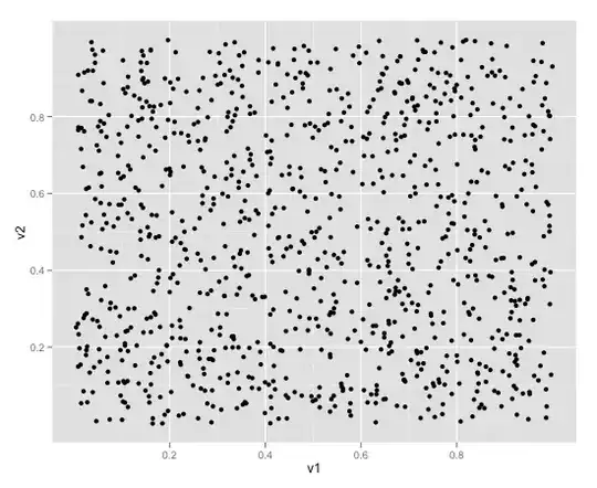
I wanted to do the scatter plot. But given the high dispersion on those dots, I would like to bin the x-axis and then for each bin of the x-axis, plot the quantiles of the y-values of the data points in each bin:

  1. Uniform bin size on the x-axis;
  2. Equal number of observations in each bin;

(These two are separate cases.)

How to do that in R? I guess for the sake of prettyness, I'd better do it in ggplot2?

The origin of this problem was that a plain scatter plot with too many points with high dispersion generated too many points flying all over places.
We are trying to smooth the charts a bit...
Any good recommendations?

How about "plot the quantiles of each bin"?

But how are the quantiles plotted? Shall I specify 50% quantile, etc?


[p.s. Update 3/11/2011]: I am trying the following following R-help posts:

DAT <- data.frame(x = runif(1000, 0, 20), y = rnorm(1000))
DAT$xbin <- with(DAT, cut(x, seq(0, 20, 2)))

p <- ggplot(DAT, aes(x = x, y = y)) + geom_point(alpha = 0.2) +
stat_quantile(aes(colour = ..quantile..), quantiles = seq(0.05, 0.95,
by=0.05)) + facet_wrap(~ xbin, scales = "free")
print(p)

My questions are:

1) How do I make it "equal number of points" in each bin along the x-axis? i.e. the original number 2 requirement in my question?

2) And also, no matter how I changed the quantiles = seq(0.05, 0.95, by=0.05)) line, the number of lines in each bin and the number of legends on the right side of the each plot are different...

What's the catch? Am I missing something here?

I thought the number of quantile lines and the number of legends should be exactly the same, no?

chl
  • 50,972
  • 18
  • 205
  • 364
Luna
  • 2,255
  • 5
  • 27
  • 38
  • can you give an example? scatterplots generally don't have bins. – David LeBauer Mar 10 '12 at 00:53
  • It's not unusual: the bigger the marker, the more cases it represents. – rolando2 Mar 10 '12 at 01:09
  • 1
    Have you ever looked at the Quick-R website? Under scatterplots, there's a section on high density scatterplots that discusses binning: www.statmethods.net/graphs/scatterplot.html – gung - Reinstate Monica Mar 10 '12 at 01:18
  • 2
    Of possible interest: [More efficient plot functions in R when millions of points are present?](http://stats.stackexchange.com/q/7348/930), [Visual Analytics of Large Multi-Dimensional Data Using Variable Binned Scatter Plots](http://bib.dbvis.de/uploadedFiles/20.pdf) or [Variable Binned Scatter Plots](http://bib.dbvis.de/uploadedFiles/300.pdf) (PDFs), or [Hexbins!](http://indiemaps.com/blog/2011/10/hexbins/). – chl Mar 10 '12 at 11:32
  • @gung: thx but on the Quick-R website it doesn't talk about the two cases of binning that I am looking for. – Luna Mar 12 '12 at 00:22
  • 1
    @Luna [Cross-posting](http://r.789695.n4.nabble.com/How-do-I-do-a-pretty-scatter-plot-using-ggplot2-td4461121.html) is generally not encouraged; when it happens, it is usually a good idea to link to the other thread (here, on R-help) to let your answerers there be informed of alternative solutions that were proposed to you. – chl Mar 12 '12 at 07:24

3 Answers3

7

You can to do this in the new version of ggplot2 (0.9).

You can try it out:

library(ggplot2) #make sure the newest is installed

df <- data.frame(v1 = runif(1000), v2 = runif(1000))

bin.plot<-qplot(data=df,
                x=v1,
                y=v2,
                z=v2)

Basic plot

bin.plot+stat_summary_hex(fun=function(z)length(z))

Plot with hexagonal binning

bin.plot+stat_summary2d()(fun=function(z)length(z))

Plot with rectangular binning

These may also be of interest if you want to bin only on one variable

geom_violin
geom_dotplot

You can also start by binning your data and then jitter it.

The release notes of ggplot2 0.9: http://cloud.github.com/downloads/hadley/ggplot2/guide-col.pdf

For development versions of ggplot2

#library(devtools)
#dev_mode()
#install_github("ggplot2")
#library(ggplot2)
Etienne Low-Décarie
  • 1,563
  • 3
  • 16
  • 27
5

You may want to look at these two entries from 'SAS and R':

http://sas-and-r.blogspot.com/2011/07/example-91-scatterplots-with-binning.html
http://sas-and-r.blogspot.com/2011/07/example-92-transparency-and-bivariate.html

They cover the use of binning, transparency and bivariate kernel density estimators for scatter plots of large amounts of data. They might serve as decent starting points.

I'm rather biased against ggplot2, so I won't comment on whether or not you need to use it for prettyness - I find the figures in these entries to be perfectly appealing.

Fomite
  • 21,264
  • 10
  • 78
  • 137
  • Why are you biased against ggplot2? – mark999 Mar 10 '12 at 07:52
  • 3
    @mark999 I...just don't like most plots made in ggplot2. Essentially I think the message people have come out with is "ggplot means pretty graphs" when it should have been "thinking actively about how you visualize things means pretty graphs". A busy, unclear plot in ggplot2 isn't any more useful. – Fomite Mar 12 '12 at 00:41
  • @EpiGrad Sounds more like you don't like the skills/aesthetic judgements of most people you see using ggplot2, than ggplot2 itself. – joran Mar 13 '12 at 01:50
  • @joran A bit of both. I also don't particularly care for ggplot's aesthetics, but I recognize that that's hopelessly subjective. – Fomite Mar 13 '12 at 19:49
  • Part (if not all) of the reason ggplot2 is so popular is because of the implementation of the grammar of graphics in an easily readable/understandable fashion. I agree you can make crappy charts using any program, and I come across *default* settings I don't like all the time (in alot of different stat software/programs). Whether the program gives you the flexibility to change them to your liking is a key point then (and ggplot2 certainly does this). – Andy W Mar 15 '12 at 12:47
3

It's not really an answer to your question about binning one easy solution in ggplot2 to deal with large amount of data in scatterplots is to use the alpha parameter to set some transparency

> df <- data.frame(v1 = rnorm(100000), v2 = rnorm(100000))
> ggplot(df, aes(x=v1, y=v2)) + geom_point(alpha = .01) + theme_bw()

Result

Gala
  • 8,323
  • 2
  • 28
  • 42
  • 1
    Note that the possibility of using hexbin with ggplot2 is discussed in this response: http://stats.stackexchange.com/a/14972/930. I, for one, believe that transparency is helpful in case there's some overlapping in the data and jittering doesn't help, but for large dataset this is not the solution. – chl Mar 10 '12 at 11:31
  • 1
    @chl I'd assert that it depends on what you want to show for a large data set. For example, transparency is very good at showing areas of high density, while still preserving outlying values, which things like binning and KDE sometimes struggle with. – Fomite Mar 12 '12 at 00:42
  • I don't understand the usefulness of "hexbin"... it's very different from what we need in this problem... thanks anyway! – Luna Mar 12 '12 at 02:02
  • @EpiGrad Agree but that really depends on sample size: over plotting is likely to obscure subtile pattern even with transparency. Other issue: vectorized output, like PDF, will be almost useless. I submitted the above code to `lattice` with `hexbin::panel.hexbinplot`: this is just a 15 Ko PDF file, as compared to the 5.5 Mo file generated when using simple points with 50% transparency. – chl Mar 12 '12 at 07:11
  • @Luna I didn't say this would solve your problem directly. I'm just mentioning some possible use of hexbin in place of transparency. – chl Mar 12 '12 at 07:19
  • I don't know if it is *the* solution but it can certainly be useful. Of course, it all depends on what you mean by “large” dataset but it remains doable in the 10000-100000 observations range and can give you a quick preview of the pattern in your data whereas you really don't see anything at all without transparency. – Gala Mar 12 '12 at 11:18
  • 1
    Another general point (which I don't think has been made), but is still applicable to this situation. Frequently I see people not reduce the size of the points. For example `ggplot(df, aes(x=v1, y=v2)) + geom_point(size = .01, alpha = .1) + theme_bw()` with Gaël's data. – Andy W Mar 15 '12 at 12:29