2

I am currently attempting to model student achievement using both categorical (mostly demographic factors) and numerical (exam scores) data.

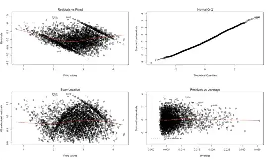
I am specifically looking for an explanation of the observed behavior in the Scale-Location diagnostic plot (below), so that I can have a better understanding of the efficacy of the model. In particular, are the trends in that graph (sort of curving lines) an artifact of the parallel line behavior in the first plot?
  • 2
    http://stats.stackexchange.com/questions/49443 might look familiar to you. – whuber Sep 26 '16 at 22:09
  • 1
    Asking specific and precise questions, instead of opinion, might be much more helpful. – T.E.G. Sep 26 '16 at 22:11
  • @whuber I looked into censored regressions a little bit and it seems to be more for situations where a significant portion of the results are at some upper and/or lower threshold, whereas I think in my case a lot of values fall into several different thresholds. Is my interpretation correct? – Miguel Rivera Rios Sep 27 '16 at 14:12
  • 1
    You cannot "fall into" a threshold: you can only exceed it or lie beneath it. Therefore I do not understand what you mean by "fall into several different thresholds." Your plots suggest the test scores must lie between two limits. (Often these are set at 0 and 100%.) It can be useful to interpret the maximum score as indicating a performance that is *at or above* the performance measured by the test and the minimum score as a performance that is *at or below* what the test can measure. As such, the data can be viewed as censored above (at a threshold of 100%) and below (at 0%). – whuber Sep 27 '16 at 15:28

0 Answers0