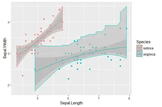
After answering to question Compare the statistical significance of the difference between two polynomial regressions in R, I realized that I have always assumed that ggplot2 plots simultaneous confidence bands, not pointwise confidence bands, without actually knowing that for sure. I asked on SO: https://stackoverflow.com/q/39110516/1711271. I got an interesting answer, which I tried to apply. Results however can be weird:
library(dplyr)
# sample datasets
setosa <- iris %>% filter(Species == "setosa") %>% select(Sepal.Length, Sepal.Width, Species)
virginica <- iris %>% filter(Species == "virginica") %>% select(Sepal.Length, Sepal.Width, Species)

# compute simultaneous confidence bands
setosa <- setosa %>% arrange(Sepal.Length)
virginica <- virginica %>% arrange(Sepal.Length)

# 1. compute linear models
Model <- as.formula(Sepal.Width ~ poly(Sepal.Length,2))
fit1  <- lm(Model, data = setosa)
fit2  <- lm(Model, data = virginica)
# 2. compute design matrices
X1  <- model.matrix(fit1)
X2  <- model.matrix(fit2)
# 3. general linear hypotheses
cht1 <- multcomp::glht(fit1, linfct = X1)
cht2 <- multcomp::glht(fit2, linfct = X2)
# 4. simultaneous confidence bands (finally!)
cc1 <- confint(cht1); cc1 <- as.data.frame(cc1$confint)
cc2 <- confint(cht2); cc2 <- as.data.frame(cc2$confint)
setosa$LowerBound <- cc1$lwr
setosa$UpperBound <- cc1$upr
virginica$LowerBound <- cc2$lwr
virginica$UpperBound <- cc1$upr

# combine datasets
mydata <- rbind(setosa, virginica)

# plot both simultaneous confidence bands and pointwise confidence
# bands, to show the difference
library(ggplot2)
# prepare a plot using dataframe mydata, mapping sepal Length to x,
# sepal width to y, and grouping the data by species
ggplot(data = mydata, aes(x = Sepal.Length, y = Sepal.Width, color = Species)) +
# add data points
geom_point() +
# add quadratic regression with orthogonal polynomials and 95% pointwise
# confidence intervals
geom_smooth(method ="lm", formula = y ~ poly(x,2)) +
# # add 95% simultaneous confidence bands
geom_ribbon(aes(ymin = LowerBound, ymax = UpperBound),alpha = 0.5, fill = "grey70")
Questions:
- How would you plot the simultaneous confidence bands? Using ribbons with some transparency sort of does the job, but I'd rather not have the colored contours around the ribbons.
- Why both the upper and lower boundary of the
setosaribbon are so smooth, while the upper bound of thevirgincaribbon is so jagged? I would expect simultaneous confidence bands to be "hyperbolic" bands around the regression curve, thus very smooth. Am I computing the right thing here?
PS just for the sake for clarity, I'm not interested in prediction bands. Here the focus is on simultaneous confidence bands and pointwise confidence bands.
