2

I found this excellent code snippet online which gives the code for boostrapping a kernel density estimate to get confidence bands. Now, I am not that well versed in R, and would like to know what's happening. I have commented in the source code below what I think each line does, but I might be wrong. Suggestions?

mu = 84.5; s = 0.01
Data_mat = rnorm(1000,mu,s)                                              

#Generate Simple Kernel Density Estimate uing the default R function
fit1 <- density(Data_mat)     

#Bootstrap starts
fit2 <- replicate(1000,
                    { 
                      #Sample with replacement, for the bootstrap from the
                      #original dataset and save the resample to x
                      x <- sample(Data_mat, replace=TRUE)                    

                      #Generate the density from the resampled dataset, and
                      #extract y coordinates to generate variablity bands
                      #for that particular x coordinate in the smooth curve
                      density(x, from=min(fit1$x), to=max(fit1$x))$y
                    }) 

#Apply the quantile function to the y coordinates to get the
#bounds of the polygon to be drawn on the y axis?
#if so, why the 2.5% to 97.5% range? Am I missing a convention here?
fit3 <- apply(fit2, 1, quantile, c(0.025,0.975) )

#Adjust plot function to display line and variablity band from fit3
plot(fit1, ylim=range(fit3),xlim = c(-5,150))

#draw the actual polygon using the x coordinates from the original density
#and the y coordinates from calculated quantile variablity bands
polygon( c(fit1$x, rev(fit1$x)), c(fit3[1,], rev(fit3[2,])),
        col='black', density = -0.5, border=F)

#Display the line again
lines(fit1)
MichaelChirico
  • 1,270
  • 1
  • 9
  • 20
Rover Eye
  • 535
  • 1
  • 4
  • 15
  • 1
    Your interpretation is correct. As for the quantiles, that's a standard statistical convention. Since people most commonly want to know 95% confidence intervals, the 2.5% and 97.5% quantiles bound that interval. You can always change those numbers if you want different confidence intervals. – mkt Jul 16 '16 at 22:00
  • related threads that might be helpful: http://stats.stackexchange.com/questions/155488/simulate-from-kernel-density-estimate-empirical-pdf and http://stats.stackexchange.com/questions/157388/get-quantile-function-of-dynamic-mixture-model – Antoine Jul 17 '16 at 13:18

1 Answers1

4

You've basically got it. A few extra comments.

density(x, from = min(fit1$x), to = max(fit1$x))$y

Compared to fit1 <- density(Data_mat), this takes the extra parameters to ensure that, when the resampling x doesn't capture the endpoints of Data_mat, the resampled output still covers the same range.

Note that, since the parameter n = 512 in both lines (implicitly), this guarantees the fit1 x-coordinates and the bootstrapped x-coordinates are identical.

Each repetition of replicate thus returns an equal-length vector; in this case, replicate compiles the result at the end into an array; each repetition becomes a column, so the array fit2 will have 1000 columns.

apply uses the argument 1 (named MARGIN) to tell it whether to compute the quantiles row-wise or column-wise (also generalizes to higher dimensions); 1 is row-wise (so we collapse each column -- collapsing across bootstrap repetitions, as desired). 2 would have been column-wise.

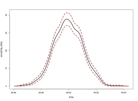
Lastly, this bit about using polygon strikes me as a bit odd. I usually just use matplot and set the confidence bands in dashed lines, like so:

matplot(fit1$x, cbind(fit1$y, t(fit3)), type = "l",
        lty = c(1, 2, 2), lwd = 3, col = c("black", "red", "red"))

type = "l" means plot lines; lty tells to plot a solid line for fit1$y and a dashed line for the confidence bands; lwd = 3 makes the lines thicker; and col sets the colors. Output:

enter image description here

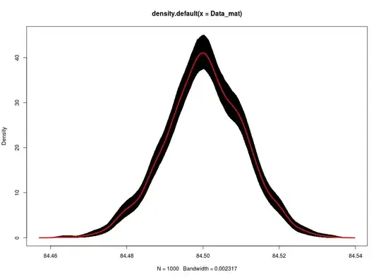
That said, if you do want a shaded region for the confidence band, you need to change the first line; I'm not sure why, but xlim = c(-5, 150) is making the plot unviewable. Just remove that bit and it plots fine.

You also need to change the color of fit1 line to make it visible against the black polygon; I get the following better output with these adjustments:

plot(fit1, ylim = range(fit3))
polygon( c(fit1$x, rev(fit1$x)), c(fit3[1,], rev(fit3[2,])),
        col='black', density = -0.5, border=F)
lines(fit1, col = "red", lwd = 3)

enter image description here

MichaelChirico
  • 1,270
  • 1
  • 9
  • 20
  • Many thanks. If I may trouble you again, Can you please explain what you meant by Note that, since the parameter n = 512 in both lines (implicitly), this guarantees the fit1 x-coordinates and the bootstrapped x-coordinates are identical. ? – Rover Eye Jul 17 '16 at 19:42
  • @RoverEye Any kernel density estimate basically picks points on the x axis at which to estimate the density (using the frequency of random draws in the neighborhood, basically) at that point. `density` uses `n` equally spaced points between `from` and `to`. `fit1` chooses `from` and `to` automatically based on the vector supplied, then fills in the other 510 points at equal intervals. In the bootstrap step, by picking the same endpoints of the interval, and the same number of points, the chosen x axis points must be the same. – MichaelChirico Jul 17 '16 at 19:44
  • I see thanks.apologies if I'm thick here, how is n = 512 decided upon for the points between the from and to? – Rover Eye Jul 17 '16 at 20:47
  • that's just the default chosen by R statisticians. you can control that by adding `n = 100` as an argument to `density` to choose 100 points if you so choose. see `?density` which is where I found this – MichaelChirico Jul 17 '16 at 21:53