5

In a simple experiment I asked participants to make acceptability judgements (9-point Likert scale) when they observed different animated virtual characters. I have two factors: character (7 levels) and motion (5 levels).

Two-way ANOVA showed significant interaction between the above factors, so I want to explore this interaction better. I've run a post-hoc Tukey test and looked at critical differences between mean acceptability ratings for all characters, and all levels of motion. It's a large matrix (rough example can be seen in this post in stackoverflow) that might not be entirely clear for the interpretation. It's been suggested to me that maybe I could have visualize or statistically explore this interaction between characters and motion better.

Any suggestions how I could do that (preferably in R)?
Geek On Acid
  • 209
  • 1
  • 10
  • 2
    We won't eat you alive :) – chl Dec 18 '11 at 22:32
  • 2
    One way is to plot the mean of fitted values from your model, conditional on values of these predictors of interest. You could make the x-axis one of the predictors, and then use a different color for different values of the other predictor (with the y-axis being the mean of the fitted values). You can do this with R basic graphics, lattice, ggplot, or other packages; e.g. http://www.jstatsoft.org/v08/i15/paper – Michael Bishop Dec 24 '11 at 22:44
  • @MichaelBishop (+1) Besides basic interaction plot, John Fox's paper has interesting discussion about marginalization over higher-order interaction terms, etc. I feel like you could expand your comment into a reply, with some illustrations. – chl Dec 25 '11 at 19:52
  • @MichaelBishop (+1) Yes, as chl pointed out, it's a great little article, and I also feel you could show some example on how you would use it, if you don't mind... – Geek On Acid Feb 16 '12 at 16:22

2 Answers2

8

In R, there is a function coplot which plots your main effect and outcome in a grid of domains for each conditioning factor in a scatter-plot matrix. By examining the change between trends in the panel of plots, you can assess the extent of interaction present in the data.

AdamO
  • 52,330
  • 5
  • 104
  • 209
  • (+1) Interesting idea. I always think of coplots as a way to show trivariate relationships between numerical variables. Re-reading the help page, I see there are examples of use with factors. – chl Dec 25 '11 at 19:48
6

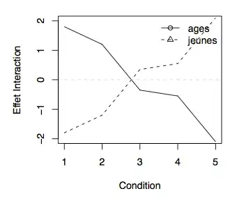
If you are interested in visualizing an interaction effect specifically, you can subtract main effects (i.e., average factor effect, say $x_i$ and $x_j$) from each treatment mean (combination of factor levels, indexed by $i$ and $j$) based on the relation

$$\gamma_{ij} = \bar x_{ij} - \bar x_i - \bar x_j + \bar x$$

This will yield $i$ (or $j$) curves where every value are expressed as deviation from a baseline which is simply the grand mean ($\bar x$). This idea is developed in Howell, Statistical Methods for Psychology. Below is an illustration with one of Howell's dataset (a study on number of words recalled as a function of subjects' age and recall condition, N=100).

enter image description here

chl
  • 50,972
  • 18
  • 205
  • 364