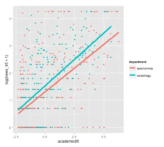
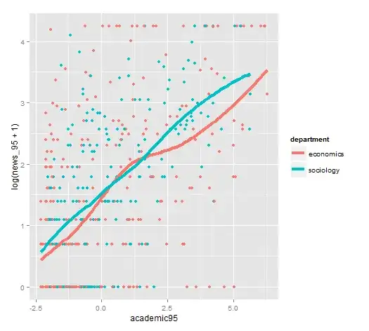
I have a quasi-poisson regression model for analysing the correlation between academic prestige and bulic visibility.
I have a set of independent variables - continuous and dummies in this model. I would like to create scatter plots which describes this model and maybe indicate of an interaction effects. I understand that poisson models are log-linear models, so I tried to plot scatter plot in which the dependent variable is in log transformation. However, I don't know which line to choose- should it be a linear regression line or loess line (I'm using ggplot2 plots). for example, in the model, the economics department seem to be more visible then the sociology department. However, in the the plots it seem to be the opposite.
How can I make a reliable plot?

