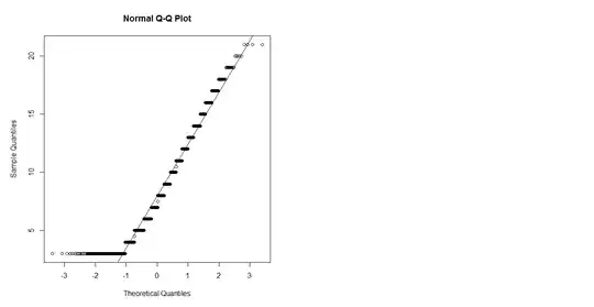
This QQ plot has the following salient features:
The stairstep pattern, in which only specific, separated heights ("sample quantiles") are attained, shows the data values are discrete. Almost all are whole numbers from $3$ through $21$. A few half-integers appear. Evidently some form of rounding has occurred.
Because the extreme "theoretical quantiles" are at $\pm 3.2$ (roughly), there must be around $1400$ data shown. This is because the extremes for this much Normally distributed data would have Z-scores about $\pm 3.2$. (This estimate of $1400$ is rough, but it's in the right ballpark.)
There is a large number of values at the minimum of $3$, far more than any other value. This is characteristic of left censoring, whereby any value less than a threshold ($3$) is replaced by an indicator that it is less than that threshold--and, for plotting purposes, all such values are plotted at the threshold. (For more on what censoring does to probability plots, see the analysis at https://stats.stackexchange.com/a/30749.)
Apart from this "spike" at $3$, the rest of the points come fairly close to following the diagonal reference line. This suggests the remaining data are not too far from Normally distributed.
A closer look, though, shows the remaining points are initially slightly lower than the reference line (for values between $5$ and $10$) and then slightly greater (for values between $13$ and $20$) before returning to the line at the end (value $21$). This "curvature" indicates a certain form of non-normality.
This particular kind of curvature is consistent with data that are starting to follow an extreme-value distribution. Specifically, consider the following data-generation mechanism:
Collect $k\ge 1$ independent, identically distributed Normal variates and retain just the largest of them.
Do that $n = 1400$ times.
Left-censor the data at a threshold of $3$.
Record their values to two or three decimal places.
Round the values to the nearest integer--but don't round any value that is exactly a half-integer (that is, ends in $.500$).
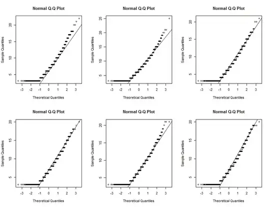
If we set $k=50$ or thereabouts and adjust the mean and standard deviation of those underlying Normal variates to be $\mu = -10$ and $\sigma = 7.5$, we can produce random versions of this QQ plot and most of them are practically indistinguishable from it. (This is an extremely rough estimate; $k$ could be anywhere between $8$ and $200$ or so, and different values of $k$ would have to be matched with different values of $\mu$ and $\sigma$.) Here are the first six such versions I produced:
What you do with this interpretation depends on your understanding of the data and what you want to learn from them. I make no claim that the data actually were created in such a way, but only that their distribution is remarkably like this one.
This is R code to reproduce the figure (and generate many more like it if you wish).
k <- 50
mu <- -10
sigma <- 7.5
threshold <- 3
n <- 1400
#
# Round most values to the nearest integer, occasionally
# to a half-integer.
#
rnd <- function(x, prec=300) {
  y <- round(x * prec) / prec
  ifelse(2*y == floor(2*y), y, round(y))
}
q <- c(0.25, 0.95) # Used to draw a reference line
par(mfcol=c(2,3))
set.seed(17)
invisible(replicate(6, {

  # Generate data
  z <- apply(matrix(rnorm(n*k), k), 2, max) # Max-normal distribution
  y <- mu + sigma * z                       # Scale and recenter it
  x <- rnd(pmax(y, threshold))              # Censor and round the values

  # Plot them
  qqnorm(x, cex=0.8)
  m <- median(x)
  s <- diff(quantile(x, q)) / diff(qnorm(q))
  abline(c(m, s))
  #hist(x)    # Histogram of the data
  #qqnorm(y)  # QQ plot of the uncensored, unrounded data
}))