Reading this post by @gung brought me to try to reproduce his superb illustrations, and led ultimately to question something I had read or heard, but that I'd like to understand more intuitively: Why is an OLS lm controlling for a correlated variable better (can I say 'better' tentatively?) than a mixed-effects model with different intersects and slopes?
Here's the toy example, again trying to parallel the post quoted above:
First the data:
set.seed(0)
x1 <- c(rnorm(10,3,1),rnorm(10,5,1),rnorm(10,7,1))
x2 <- rep(c(1:3),each=10)
    y1 <- 2  -0.8 * x1[1:10] + 8 * x2[1:10] +rnorm(10)
    y2 <- 6  -0.8 * x1[11:20] + 8 * x2[11:20] +rnorm(10)
    y3 <- 8  -0.8 * x1[21:30] + 8 * x2[21:30] +rnorm(10)
y <- c(y1, y2, y3)
And the different models:
library(lme4)

fit1 <- lm(y ~ x1)
fit2 <- lm(y ~ x1 + x2)
fit3 <- lmer(y ~ x1 + (1|x2))
fit4 <- lmer(y ~ x1|x2, REML=F)
Comparing Akaike information criterion (AIC) between models:
AIC(fit1, fit2, fit3, fit4)

     df      AIC
     df      AIC
fit1  3 184.5330
fit2  4  97.6568
fit3  4 112.0120
fit4  5 114.8401
So it seems that the best model is lm(y ~ x1 + x2), which I guess make sense given the strong correlation between x1 and x2 cor(x1,x2) [1] 0.8619565.
But the question is, What is the intuition behind this behavior, when the mixed model with varying intercepts and slopes seems to result in coefficients that fit the data beautifully?
coef(lmer(y ~ x1|x2))
$x2

      x1       (Intercept)
1 -1.1595730    11.37746
2 -0.2586303    19.38601
3  0.2829754    24.20038

library(lattice)
xyplot(y ~ x1, groups = x2, pch=19,
           panel = function(x, y,...) {
             panel.xyplot(x, y,...);
             panel.abline(a=coef(fit4)$x2[1,2], b=coef(fit4)$x2[1,1],lty=2,col='blue');
             panel.abline(a=coef(fit4)$x2[2,2], b=coef(fit4)$x2[2,1],lty=2,col='magenta');
             panel.abline(a=coef(fit4)$x2[3,2], b=coef(fit4)$x2[3,1],lty=2,col='green')
           })
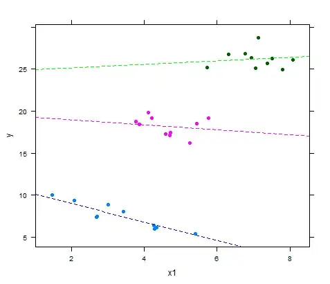
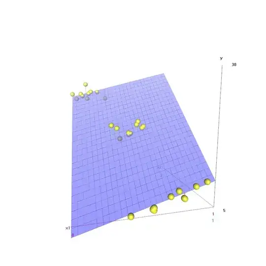
I do realize that the graphical fit of the bivariate OLS can look pretty good as well:
library(scatterplot3d)
plot1 <- scatterplot3d(x1,x2,y, type='h', pch=16,
              highlight.3d=T)
plot1$plane3d(fit2)
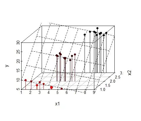
... and I don't know if this invalidates the question.