I am having some problems understanding the variable importance and feature selection graphs from caret. Here some data:
require(mlbench)
require(caret)
require(pglm)
require(e1071)
require(pROC)
require(randomForest)

data(Unions) # from the pglm package
Unions <- Unions[c("id", "year", "union", "age", "exper", "married", "ethn",
                   "disability", "rural", "region", "wage", "sector", "occ")]

Unions$union <- as.factor(Unions$union) # for classification as factor
trainIndex   <- createDataPartition(Unions$union, p=.4, list=FALSE, times=1)

UnionsTrain <- Unions[ trainIndex,]
UnionsTest  <- Unions[-trainIndex,]

#### Plotting  Variable Importance ######
control  <- trainControl(method="repeatedcv", number=10, repeats=3)
LVQmodel <- train(union~., data=UnionsTrain, method="lvq", preProcess="scale",
                  trControl=control)
LVQimportance <- varImp(LVQmodel, scale=FALSE)
plot(LVQimportance)
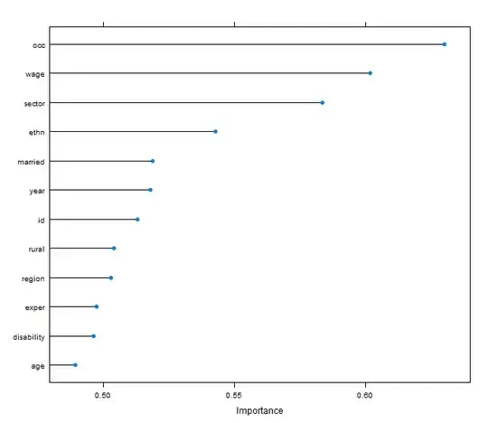
How can I interpret the following graph? Using that set up, may I say, that feature Wage was in ca. 6 out of 10 cases important to classify a union member? Perhaps one could provide a more substantial interpretation.
Additionally I have used the graphical feature selection:
#### Plotting  Feature Selection ######
rfecontrol <- rfeControl(functions=rfFuncs, method="cv", repeats=5, verbose=FALSE,
                         number=5)
results <- rfe(UnionsTrain[,4:13], as.factor(UnionsTrain[,3]), sizes=c(4:13),
               rfeControl=rfecontrol, metric="Accuracy")

ggplot(results, type=c("g","o"), metric="Accuracy") +
  scale_x_continuous(breaks=4:13, labels=names(UnionsTrain)[4:13])
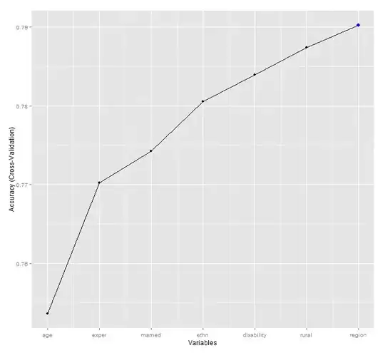
Do I have to interpret this graph in subsets? Why does the graph depend on the order of my variables rather on the accuracy of the model?