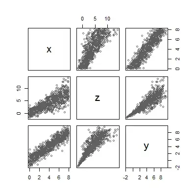
I have a dataset of 17 people, ranking 77 statements. I want to extract principal components on a transposed correlation matrix of correlations between people (as variables) across statements (as cases). I know, it's odd, it's called Q Methodology.
I want to illustrate how PCA works in this context, by extracting and visualizing eigenvalues/vectors for only a pair of data. (Because few people in my discipline get PCA, let alone it's application to Q, myself included).
I want the visualization from this fantastic tutorial, only for my real data.
Let this be a subset of my data:
Person1 <- c(-3,1,1,-3,0,-1,-1,0,-1,-1,3,4,5,-2,1,2,-2,-1,1,-2,1,-3,4,-6,1,-3,-4,3,3,-5,0,3,0,-3,1,-2,-1,0,-3,3,-4,-4,-7,-5,-2,-2,-1,1,1,2,0,0,2,-2,4,2,1,2,2,7,0,3,2,5,2,6,0,4,0,-2,-1,2,0,-1,-2,-4,-1)
Person2 <- c(-4,-3,4,-5,-1,-1,-2,2,1,0,3,2,3,-4,2,-1,2,-1,4,-2,6,-2,-1,-2,-1,-1,-3,5,2,-1,3,3,1,-3,1,3,-3,2,-2,4,-4,-6,-4,-7,0,-3,1,-2,0,2,-5,2,-2,-1,4,1,1,0,1,5,1,0,1,1,0,2,0,7,-2,3,-1,-2,-3,0,0,0,0)
df <- data.frame(cbind(Person1, Person2))
g <- ggplot(data = df, mapping = aes(x = Person1, y = Person2))
g <- g + geom_point(alpha = 1/3)  # alpha b/c of overplotting
g <- g + geom_smooth(method = "lm")  # just for comparison
g <- g + coord_fixed()  # otherwise, the angles of vectors are off
g
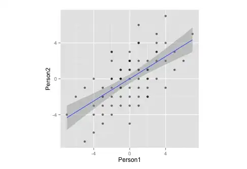
Notice that, by measurement, this data:
- ... has a mean of zero,
- ... is perfectly symmetrical,
- ... and is equally scaled on both variables (should be no difference between correlation and covariance matrix)
Now, I want to combine the two above plots.
corre <- cor(x = df$Person1, y = df$Person2, method = "spearman")  # calculate correlation, must be spearman b/c of measurement
matrix <- matrix(c(1, corre, corre, 1), nrow = 2)  # make this into a matrix
eigen <- eigen(matrix)  # calculate eigenvectors and values
eigen
gives
> $values
> [1] 1.6 0.4
>
> $vectors
>     [,1]  [,2]
> [1,] 0.71 -0.71
> [2,] 0.71  0.71
>
> $vectors.scaled
>     [,1]  [,2]
> [1,]  0.9 -0.45
> [2,]  0.9  0.45
and, moving on
g <- g + stat_ellipse(type = "norm")
  # add ellipse, though I am not sure which is the adequate type
  # as per https://github.com/hadley/ggplot2/blob/master/R/stat-ellipse.R
eigen$slopes[1] <- eigen$vectors[1,1]/eigen$vectors[2,1]  # calc slopes as ratios
eigen$slopes[2] <- eigen$vectors[1,1]/eigen$vectors[1,2]  # calc slopes as ratios
g <- g + geom_abline(intercept = 0, slope = eigen$slopes[1], colour = "green")  # plot pc1
g <- g + geom_abline(intercept = 0, slope = eigen$slopes[2], colour = "red")  # plot pc2
g <- g + geom_segment(x = 0, y = 0, xend = eigen$values[1], yend = eigen$slopes[1] * eigen$values[1], colour = "green", arrow = arrow(length = unit(0.2, "cm")))  # add arrow for pc1
g <- g + geom_segment(x = 0, y = 0, xend = eigen$values[2], yend = eigen$slopes[2] * eigen$values[2], colour = "red", arrow = arrow(length = unit(0.2, "cm")))  # add arrow for pc2
# Here come the perpendiculars, from StackExchange answer https://stackoverflow.com/questions/30398908/how-to-drop-a-perpendicular-line-from-each-point-in-a-scatterplot-to-an-eigenv ===
perp.segment.coord <- function(x0, y0, a=0,b=1){
#finds endpoint for a perpendicular segment from the point (x0,y0) to the line
# defined by lm.mod as y=a+b*x
  x1 <- (x0+b*y0-a*b)/(1+b^2)
  y1 <- a + b*x1
  list(x0=x0, y0=y0, x1=x1, y1=y1)
}
ss <- perp.segment.coord(df$Person1, df$Person2, 0, eigen$slopes[1])
g <- g + geom_segment(data=as.data.frame(ss), aes(x = x0, y = y0, xend = x1, yend = y1), colour = "green", linetype = "dotted")
g
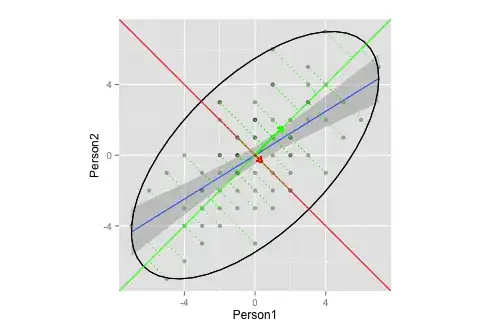
Does this plot adequately illustrate eigenvector/eigenvalue extraction in PCA?
- I'm not sure what an adequate ellipses and/or length of the vectors would be (or does it not matter?)
- I'm guessing, that the vectors have a slope of
1,-1is because of my data (ranking? symmetry?), and would differ for other data.
Ps.: this is based on the above tutorial and this CrossValidated question.
Pps.: the perpendiculars dropped on the vector are curtesy of this StackExchange answer