9

I have a survey data where I've asked a local community to rank 6 different issues they face on a scale of 1 to 6. For example,

Survey_ID Water Power Garbage Road Sewage Security
 1         1     3     2       6    5        4
 2         3     2     6       4     1       5
...

Now I want to visualize this in a simple bar chart (or whatever is best) to show how these different issues rank. As an initial attempt I've created faceted bar charts which show how many respondents ranked each issue as 1, 2, 3, 4 etc. enter image description here

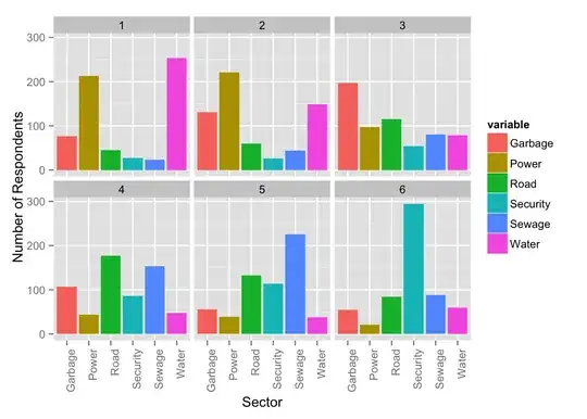
But I don't think this is really understandable to people new to the data. Is there a better way to do this? This is a static chart in R for now but I plan to create an interactive version in d3.

sfactor
  • 633
  • 4
  • 9
  • 15
  • 1
    Good question. If you can upload the data somewhere, you'll likely get more and better answers. Raw data would be better to consider facets such as pairwise relationships, but just looking at average ranking is pretty common. – xan May 19 '15 at 18:25
  • could you please tell me how to create this in R? – kRazzy R Jan 06 '18 at 19:26
  • Although it's not quite so obvious from the thread title, the thread referred to above has several suggestions that apply here, and indeed many more than just the one substantial answer here to date. – Nick Cox Nov 29 '18 at 08:33

1 Answers1

9

I would try to put the data into the same chart, not split into different panels, to allow more comparisons.

Of course, there is a lot of experimentation with graphics before you decide which show the data best. Here are a handful that I would try.

data viz attempts

Assuming 1 is most important I might reverse the category axis, take off the numbers, and show Most and Least Important in the bottom left chart above, like this:

stacked bar visualization

EDIT: This is an old thread, but I think it's worth adding one visualization type to the mix. It's a diverging stacked bar chart, which shows more positive rankings to the right and less positive to the left. I think it more clearly shows the sentiment of the survey responses.

diverging stacked bar visualization

I made this in Excel, believe it or not. It's very tedious to do so by hand, but I've written a commercial program to automate the process.

Jon Peltier
  • 381
  • 3
  • 6