3

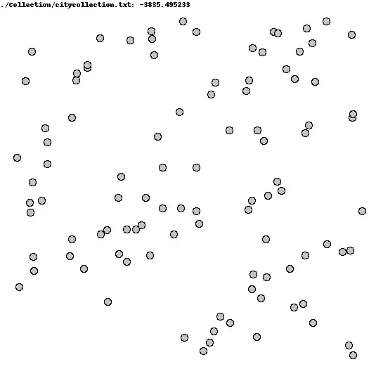
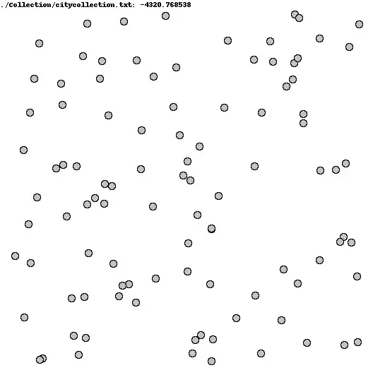
I'm looking for a way to quantify how "clumped" vs homogeneously/uniformly distributed points are in a graph. Each collection has 100 points as (x,y) pairs.

I've attached two graphs as an example. The top one (I think) is visibly more clumped than the bottom one.

Clustered Spread out

kjetil b halvorsen
  • 63,378
  • 26
  • 142
  • 467
Alex H
  • 148
  • 7
  • 1
    One possibility: you might look at the distribution of nearest-neighbor distances, or some lower order quantile of the distribution of interpoint distances. – Glen_b Apr 25 '15 at 19:38
  • What about this: put 100 uniformly distributed points on top of your graph and calculate the differences between each of your point and the nearest uniformly distributed point. This gives you 100 values, on which you can calculate average, median etc. or display histograms, boxplots etc. – alesc Apr 25 '15 at 19:59
  • @Glen_b It's working now! (mean of 4 nearest neighbor distances) – Alex H Apr 25 '15 at 22:51
  • 1
    There seems to be an assumption here that the units of measurement on each axis are the same. – Nick Cox Jan 05 '19 at 19:42
  • Looking at average nearest neighbour distances is a good approach. You might find other common figures under "measures of spatial dispersion", a well studied topic in spatial stats. – Michael M Jan 05 '19 at 19:51

1 Answers1

1

This is a spatial point process and could be analyzed as such. One approach is via Ripley's $K$ function, which measures $K(t)$ the expected number of points within distance $t$ from a point of the pattern ($\lambda$ is the intensity of the process). This is discussed in Venables & Ripley's MASS (the book), section 15.3 in fourth edition. A post with some examples: Ripley's K Function and L Function for Point Patterns

kjetil b halvorsen
  • 63,378
  • 26
  • 142
  • 467