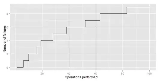
I have the graph like this:
R code for generating it is:
DF <- data.frame(date = as.Date(runif(100, 0, 800),origin="2005-01-01"),
                 outcome = rbinom(100, 1, 0.1))
DF <- DF[order(DF$DateVariable),] #Sort by date
DF$x <- seq(length=nrow(DF)) #Add case numbers (in order, since sorted)
DF$y <- cumsum(DF$outcome)
library(ggplot2)
ggplot(DF, aes(x,y)) + geom_path() + #Ploting
scale_y_continuous(name= "Number of failures") +
scale_x_continuous(name= "Operations performed")
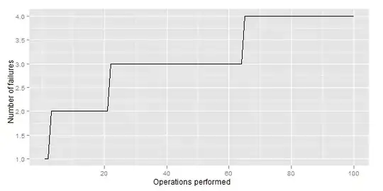
I want something like this:
The difference is in the form of steps in case of failure (I need rectangular).
My questions are:
- How to achieve this with ggplot2?
- Is there any better option for visualizing failure rate over time/iterations performed?
- What variant is easier to understand: this or that or, maybe something different?