Your comment has the right idea:
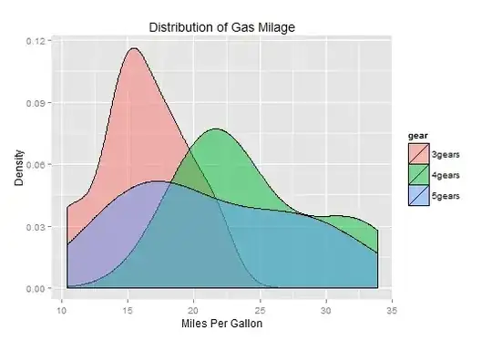
Is it telling that 16 Miles Per Gallon mileage is provided nearly a 11% of the times for 3 geared cars?? something like that??
You are pretty much right.
You might find it instructive to compare these graphs. First, a side note: In my version of R, the mtcars dataset has gear has a numeric variable, not a factor, so to get a plot that looks like yours, I have to do it this way:
qplot(x=mpg, data=mtcars, geom='density', fill=as.factor(gear), alpha=I(0.5))
You might find it instructive to compare the plot you made to these:
qplot(x=mpg, data=mtcars, geom='histogram', fill=as.factor(gear),
     alpha=I(0.5), binwidth=2)
That graph "stacks" the histogram for each gear category on top of each other, so to get a histogram more comparable to your density plot, try:
qplot(x=mpg, data=mtcars, geom='histogram', fill=as.factor(gear),
     alpha=I(0.5), binwidth=2, position='identity')
Now it's a bit hard to see the histograms, so try
qplot(x=mpg, data=mtcars, geom='histogram', fill=as.factor(gear),
     alpha=I(0.5), binwidth=2, position='identity', color=I('black'))
to clearly see the outlines of the histogram.
You might not know it, but the default value of the y aesthetic in geom_histogram() is equal to the count of the values in the data that are in the histogram bin. Thus this produces an identical plot to the one above:
qplot(x=mpg, data=mtcars, geom='histogram', fill=as.factor(gear),
     alpha=I(0.5), binwidth=2, position='identity', color=I('black'),
     y=..count..)
Now, instead of plotting the absolute counts, you can plot the percentage of counts by dividing by the total:
qplot(x=mpg, data=mtcars, geom='histogram', fill=as.factor(gear),
     alpha=I(0.5), binwidth=2, position='identity', color=I('black'),
     y=..count../sum(..count..))
Does that y-axis now look anything like the density plot you asked about?
qplot(x=mpg, data=mtcars, geom='density', fill=as.factor(gear),
     alpha=I(0.5), position='identity', color=I('black'),
     y=..count../sum(..count..))