I'm using PCA for the first time and just experimenting with it. I used PCA on my dataset that can be found here
wine <- read.csv("wine_nocolor.csv")
wine1 <- wine[2:13]
pca <- princomp(wine1[1:11], cor=TRUE)
biplot(pca)
produces this plot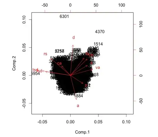
Questions
- How would I interpret the above graph?
- My aim is to apply dimension reduction to see which attributes can be taken out while not losing meaning of the data. How can I do this with PCA?