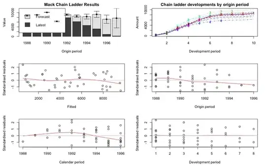
I agree, at first glance it looks like a change in calendar year trend at 1992. (Indeed, you can't see much trend in the other two directions, because the chain ladder has parameters that broadly pick up the trend changes in those directions, so that's the one plot you tend to look for changing trends in).
Consider just the left half of the calendar period plot (up to 1992):
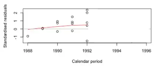
Ignore the red line if you can, and just consider where you think the data seem to be heading (keeping in mind to get the overall "gist" -- try not to let one point overly influence your impression. I find it helps to cover points and see if my impression changes in their absence; if it does, that points overly influencing my impression).
If the trend was similar after that, where would you think it should be for 1993-96?
Now look at the rest (noting the multiple almost-coincident points at the bottom right):
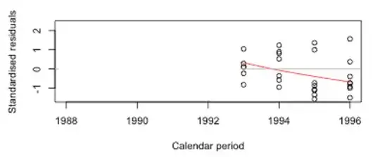
and (again, ignoring the red line) try to "backcast" the first half of the diagram.
If you're like me, you'd probably tend to draw those trends in somewhat different places, so it would make us concerned because the model simply isn't able to capture changes in that direction (though it's rather profligate with parameters in the other directions).
I think there are a variety of plausible ways to see the plot, but it does seem as if there's some kind of change there in the middle. Of course, there's not a lot of data, so we have to be fairly cautious about over-interpreting our impression there. We have a tendency to see more pattern than is really there.
[If you could leave out old payments with the chain ladder, it would be tempting to see if it made a difference to only look at the more recent years, but because it works with predicting cumulated data from previous cumulatives, you can't; the old payments are unavoidably there. You might look at patterns in one-year-ahead prediction errors, but they wouldn't be all that different from what you see here.]
It looks perhaps more like a level drop immediately after 1992, but the loess line tends to smooth over those kind of effects. (I should clarify -- the strength of the indication is not very strong ... but the consequences may be quite substantial.)
In short: there's at least some indication of a change in trend in the plot there, but it's not especially strong, and it's not completely clear that it's quite like the red line suggests.
[The Chain Ladder model has no mechanism for dealing with such a trend change, though they're common -- due to changes in economic inflation, in social trends or judicial trends, in effects peculiar to the specific line of business (such as superimposed inflation), or sometimes to effects at the company level.]
However, the fit to the most recent years of data isn't bad, so it might not be too problematic to use that forecast for the next year (but you'd have to worry about further trend changes - it's no unusual to see a short term trend change followed by a return to approximately the slope of the original trend, for example).
--
The data looks sort of familiar for some reason. Is that one of the built in data sets in the package, or from something else?
 This is a research project. I am asking your inputs to confirm my assumptions.