I was trying to understand qqPlot and found that for finding Normal Distribution of data , qqPlot is a good tool.
Then I ran 2 set of examples and got the following output where in both the case, all the points lies close to the identity line but both the graph gave a different look-
model2 <- lm(Withdrawal ~ Deposit   +Balance,data = cdata)
#to find the normal distribution of data
qqPlot(model2,id.n=3)
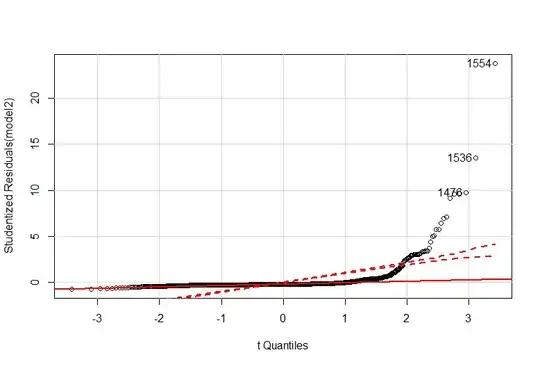
Here all the points are close to X-axis , so what should I derive here , is it normal distribution.
Lets consider the other example-
    row.names   education   income  women   prestige    census  type
1   gov.administrators  13.11   12351   11.16   68.8    1113    prof
2   general.managers    12.26   25879   4.02    69.1    1130    prof
3   accountants 12.77   9271    15.70   63.4    1171    prof
4   purchasing.officers 11.42   8865    9.11    56.8    1175    prof
5   chemists    14.62   8403    11.68   73.5    2111    prof
6   physicists  15.64   11030   5.13    77.6    2113    prof
7   biologists  15.09   8258    25.65   72.6    2133    prof
8   architects  15.44   14163   2.69    78.1    2141    prof
9   civil.engineers 14.52   11377   1.03    73.1    2143    prof
10  mining.engineers    14.64   11023   0.94    68.8    2153    prof
11  surveyors   12.39   5902    1.91    62.0    2161    prof
12  draughtsmen 12.30   7059    7.83    60.0    2163    prof
13  computer.programers 13.83   8425    15.33   53.8    2183    prof
14  economists  14.44   8049    57.31   62.2    2311    prof


data(Prestige)
model2 <- lm(prestige ~ education*type +log2(income)*type, data = Prestige)
qqPlot(model2$res,id.n=3)
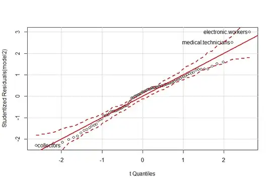
Here the line crosses almost 45 degree and the plotted points fall closely onto the identity line, so the data do not seem to come from the normal distribution So exactly what is the difference between these 2 plots.