I've noticed in my own work this pattern when examining a spatial correlogram at varying distances a U-shaped pattern in the correlations emerges. More specifically, strong positive correlations at small distance bins decrease with distance, then reach a pit at a particular point then climb back up.
Here is an example from the Conservation Ecology blog, Macroecology playground (3) – Spatial autocorrelation.
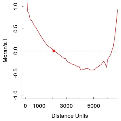
These stronger positive auto-correlations at larger distances theoretically violate Tobler's first law of geography, so I would expect it to be caused by some other pattern in the data. I would expect them to reach zero at a certain distance and then hover around 0 at further distances (which is what typically happens in time series plots with a low order AR or MA terms).
If you do a google image search you can find a few other examples of this same type of pattern (see here for one other example). A user on the GIS site has posted two examples where the pattern appears for Moran's I but does not appear for Geary's C (1,2). In conjunction with my own work, these patterns are observable for the original data, but when fitting a model with spatial terms and checking the residuals they do not appear to persist.
I haven't come across examples in time-series analysis that display a similar looking ACF plot, so I'm unsure of what pattern in the original data would cause this. Scortchi in this comment speculates that a sinusoidal pattern may be caused by an omitted seasonal pattern in that time series. Could the same type of spatial trend cause this pattern in a spatial correlogram? Or is it some other artifact of the way that the correlations are calculated?
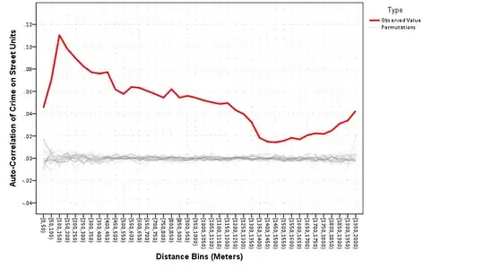
Here is an example from my work. The sample is quite large, and the light grey lines are a set of 19 permutations of the original data to generate a reference distribution (so one can see the variance in the red line is expected to be fairly small). So although the plot is not quite as dramatic as the first one shown, the pit and then rise at further distances appear pretty readily in the plot. (Also note the pit in mine is not negative, as is the other examples, if that materially makes the examples different I do not know.)
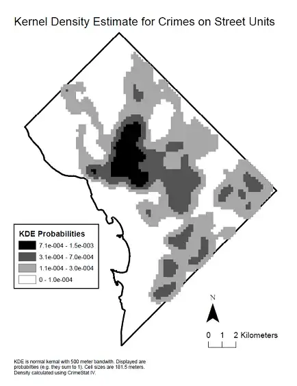
Here is a kernel density map of the data to see the spatial distribution that produced said correlogram.