You should definitely support your analysis with graphs. This is an integral part of any regression discontinuity design study because consistent estimation of the treatment effect requires that
- you have specified the correct functional form (polynomials) on both sides of the threshold (or chosen an appropriate kernel and bandwidth for the non-parametric method)
- no other variables jump around the threshold other than the outcome
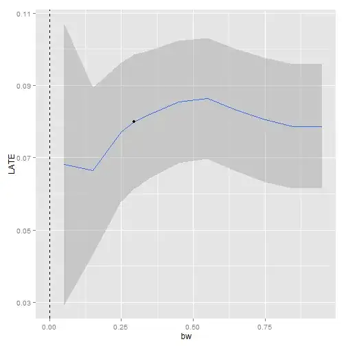
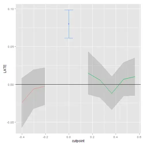
To test whether you have the right number of polynomials you can divide your data up into bins and include a dummy for each bin in your regression. If your functional form is right, non of those dummies should be significant (see Lee and Lemieux, 2010). If some bin dummies are significant you can then add higher order polynomials until this significance vanishes. In the same paper they also suggest some methods for choosing the appropriate bandwidth for the non-parametric RD. You should also vary the window around the cutoff and if your results are robust then the standard errors should increase but the point estimates should remain the same or at least similar.
In terms of the graphs, it is always nice to construct bins and average the variables within those bins (play around with the bin sizes to convince yourself of the robustness of your results) and plot
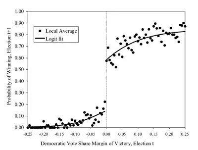
- the outcome over the forcing variable (there should be a discontinuity at the cutoff)
- your controls over the forcing variable (they should not jump around the cutoff)
- the density of the forcing variable over the forcing variable (gives you an idea whether individuals manipulated the threshold - if so, you will see a spike in the density just after the threshold)
A nice graph for points 1. and 2. looks something like this:
Related to the third point, you can also formally test for a jump in the density of the forcing variable around the cutoff. McCrary (2008) came up with a testing method for this purpose. This will tell you again whether some manipulation is going on around the threshold.
With respect to point 2., you can use your controls as outcome variables, re-run the analysis and see if they jump at the threshold. They shouldn't, otherwise your analysis will be in trouble. Other placebo tests of this sort are suggested in Imbens and Lemieux (2008).