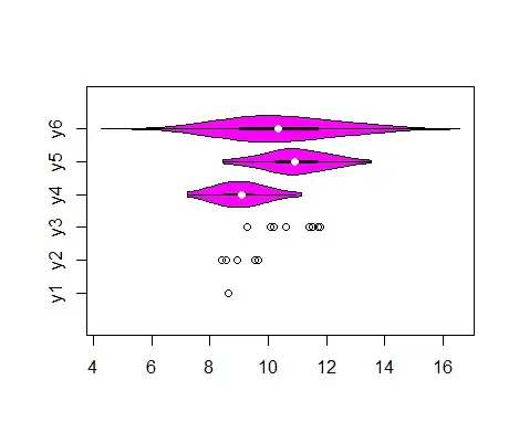
I an trying to plot 6 groups, in which 3 has a good amount of counts (ranging from 20 to 400) and the rest 3 have very small counts (1 to 9). I want to plot the distribution of a continuous variable within each of these 6 groups and be very honest in the plot about the dramatically different sizes of the groups. I am thinking about generating violin plot for the 3 groups with larger counts to show both the median and the dispersion, and for the low-count groups, plot stripchart to show individual data points.
Could anyone kindly help me find a way to do such a hybrid plot? Other plot suggestions are also welcome.