4

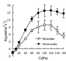
I've got data plotted for A/Ci curves (plant physiology, A=photosynthesis rate, Ci=internal CO2 concentration--essentially it's a dose-response relationship). Generally, when this type of data is presented, people just add SE error bars (like the provided image) and if they don't overlap call it significant, or they run an ANOVA on individual pairs of points (such as the two points, black and white, that sit above Ci=120).

A/Ci curve

However, I would like to find a single test for the overall dose-response relationship. So, essentially I can assert that the dose-response relationship is significantly different between the two groups (in my case, the groups are all for the same species--it's a fertilizer experiment and I want to be able to claim that the addition of fertilizer changes the kinetics of the A/Ci relationship). I would also like to be able to test more than two curves on the same plot in the same manner (but I only have 3 curves, so I could do permutations if necessary).

Also, one other issue (not represented in this image) is that there is also an X-axis error term, so the error bars should actually be crosses, not just error on the y axis--which makes using an ANOVA approach difficult, since you have to test points in both dimensions.

Any suggestions for an appropriate test? I work mostly in R, so any link to existing scripts would be ideal--but I also have access to Graphpad Prism and JMP if anyone knows how to run this type of test in either of them.

Jas Max
  • 738
  • 1
  • 6
  • 15
  • How does one achieve a Ci that is a multiple of 20? Are these measured values that have been grouped into *bins* of width 20 or are they perhaps nominal values that were induced in the laboratory (but are known to have been attained only to a certain precision)? The distinction has implications for the form of analysis. – whuber Apr 04 '14 at 16:42
  • 1
    Well, it's usually not quite this clean. A/Ci curves are generated by exposing the plant to a different Ca (a=ambient CO2,) usually in steps of 50ppm not 20, allowing the CO2 to diffuse into the plant tissue and measuring the A term. The Ci term (internal CO2 available to carbon fixing enzymes) is calculated as a function of Ca and A (as well as stomatal conductance)--it's a source-sink dynamic and the only sink for CO2 is A--so for multiple plants in the same group, you would expose them all to the same Ca, and calculate both Ci and A and generate an error term for both. Does that make sense? – Jas Max Apr 04 '14 at 16:54
  • "I want to be able to claim that the addition of fertilizer changes the kinetics of the A/Ci relationship" -- it seems to me the most principled way of achieving this is to propose a mechanistic (kinetic) model that captures the data well, fit the kinetic parameters of the model to each curve, and ask whether the parameters are significantly different. – vector07 Apr 04 '14 at 17:34
  • @vector07, Yes-you are correct. The mechanistic model hypothesis for my data is this "the addition of nitrogen increases the concentration of C-fixing enzymes, resulting in higher A at any given Ca--which also results in lower Ci at any given Ca". And, as expected, the curves for +N groups are shifted to the left and upwards--just what my hypothesis predicts. So visually, I've confirmed the hypothesis, and the error bars don't overlap, but how do I test weather the "parameters are significantly different" by comparing whole curves, rather than just the Ci or A at a particular Ca? – Jas Max Apr 04 '14 at 17:38
  • 1
    @JasMax Right, but what is the mathematical form of that model? For example, the simplest relationship could be $C_i$ is linearly related to the photosynthesis rate, so your model would be $A=m C_i +b$. However, the data clearly show non-linearity, so obviously a line isn't sufficient. Also, a line isn't a mechanism. In the plot shown you have some interesting features: a strong positive effect of $C_i$ on photosynthesis followed by saturation and actual drop off. What's the explanation for that? Can you write down a physical model of what you think is happening? – vector07 Apr 04 '14 at 17:48
  • @vector07, Ok gotcha, mathematically A/Ci's are described as having 3 parts: 1. (0-60ish on X-axis) is substrate limited, and is usually considered to be linear, 2. (60-120) = enzyme saturation, (1 & 2 are described really well by Michaelis-Menten kinetics) 3. Drop off (beyond 120) = TPU feedback (Triosephosphate utilization) where, at high A, cells experience a buildup of TP which causes negative feedback and enzymatically regulated reduction in A--part 3 is quite variable among different species (and not present in some)so I would hesitate to assign an 'equation' to it _a priori_. – Jas Max Apr 04 '14 at 19:06
  • @JasMax Excellent. So if I understand correctly, the x-axis isn't separate experiments but rather $C_i$ is a function of time? If so, and if you think the other assumptions of Michaelis-Menten kinetics are [satisfied](http://en.wikipedia.org/wiki/Michaelis%E2%80%93Menten_kinetics), then the first step might be to fit each of your curves (up to the saturation, omitting the fall off data) for the free parameters $V_{MAX}$ and $K_D$. Then your question is more appropriately framed as a pure statistics question, i.e., are the *parameters* statistically significantly different? – vector07 Apr 04 '14 at 19:46
  • @vector07 It's not quite a function of time. It works like this: a single leaf is put in a chamber with controlled conditions (light, temp, humidity, CO2). Then the ambient CO2 level is set to a chosen level, say 400ppm, and the leaf is allowed to reach steady state photosynthesis and A and Ci are recorded. Then the Ca is changed to to 350, the leaf is given a couple minutes to respond and A and Ci are recorded again--repeat all the way to Ca = 0, then go back up to 400 and beyond. I'm not sure if this is relevant to the stats, but thanks for helping me think through it. – Jas Max Apr 04 '14 at 21:07
  • 1
    Jas (and @vector07) thank you for your patient explanations. Your last comment is important, because it implies the likelihood of strong correlations among the readings for each plant. It is essential to account for that if you want a valid test of the differences between curves. I don't think I caught how you are estimating the error bars on those data, though: where do they come from? – whuber Apr 05 '14 at 00:14
  • 1
    @whuber The error bars are due to each curve representing multiple, independent measurements of different plants in the same treatment group. In the figure above, each curve represents a species with, perhaps 5 separate plants measured at each Ca point and taken through the whole curve as I described. So, each point on a particular curve is simply the group mean with SE bars. And yes, there is certainly a strong likelihood of correlation, so yes, the test should account for that. I'm thinking of something like a MANCOVA (Covariance of two variables) if that makes sense. Thanks! – Jas Max Apr 05 '14 at 03:22

0 Answers0