2

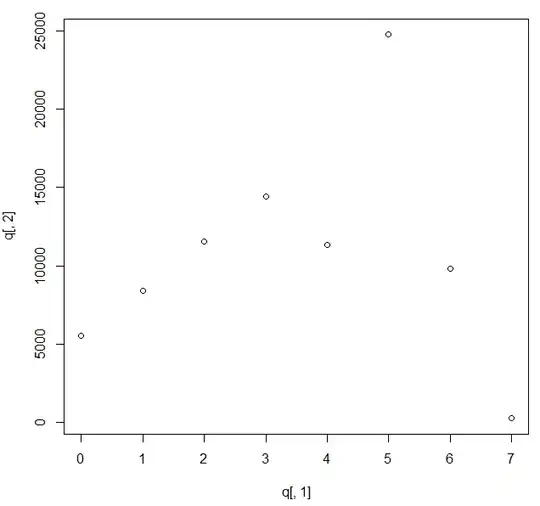
I have a count dataset that contains many zeros and a discrete variable that contains many zeros as well. I would like to see graphically which kind of correlation exists between these two variables. When I try in R to plot these two variables (plot(X, Y))) I get something that I'm not able to interpret.

enter image description here

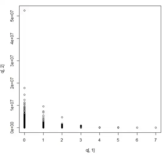
Is there any data transformation that could help me to graphically identify the relation between these two variables?

I add also the histograms for the two variables, mean and sd

enter image description here

In the figure below, the mean of q[,2] given q[,1] enter image description here

user2314405
  • 109
  • 1
  • 2
  • 8
  • This plot is inadequate for finding good answers, due to all the overlaps in the points. It does strongly suggest re-plotting the data using a logarithmic vertical scale, though. It also suggests that the second variable ought to be treated as continuous rather than discrete, given it has such a large number of distinct values. What still needs to be shown is how this plot behaves when the second variable is close to zero. – whuber Apr 03 '14 at 15:58
  • As a first, easy step, I suggest jittering q[,1]. I also suggest a univariate look at both, but especially q[,2]. Finally, can you tell us what these variables are? – Peter Flom Apr 03 '14 at 16:03
  • A transformation is unlikely to help here, but consider plotting distributions as parallel histograms, strip or dot plots (even box plots). Also plot mean and SD of the response. Much depends on whether the zeros are structural (like babies born to men) or sampling zeros (in principle, they could have been positive counts). If you have structural zeros, consider setting them on one side. – Nick Cox Apr 03 '14 at 16:03
  • @Nick Why do you suspect transformations will not help? From what I can see it's quite possible that a simple re-expression of `q[,2]` will both linearize the relationship and make it homoscedastic. But, as you point out, a lot hinges on the low range of that variable and whether it has zeros. Here is a strikingly good reproduction of the posted data in `R`: `set.seed(41); n – whuber Apr 03 '14 at 16:20
  • "unlikely to help" was all that was claimed, not least because the signal was that there is likely to be a big spike at zero; but sure, try out square root, cube root, log(value + 1). – Nick Cox Apr 03 '14 at 16:41
  • thanks for answering, @NickCox the zeros are sampling zeros. I have plotted the histograms and the mean and the SD. How I should interprete these plots? – user2314405 Apr 04 '14 at 08:03
  • @PeterFlom these variables are active users (q[,1]) in a project and the corresponding size of the project (q[,2]). What I'm trying to guess is whether or not the number of active users influences the size of a project – user2314405 Apr 04 '14 at 08:04
  • In case I try to measure the correlation between these two variables (Spearman's rank correlation), I should transform the data (like @whuber was proposing) or I could measure the correlation directly on the raw data? – user2314405 Apr 04 '14 at 08:11
  • 1
    What are needed are the mean and SD of q[,2] given q[,1], not the overall means and SDs. If there is a relationship between your variables, then the mean number of users will vary with size of project. On the face of it (and slightly contrary to @whuber) Poisson regression might be a starting place, but you may have overdispersion too. – Nick Cox Apr 04 '14 at 08:34
  • thanks @NickCox, I have added a figure with the mean of q[,2] given q[,1]. In general, when I should prefer the solution you proposed (the analysis of the mean of a variable given another variable)? Can I measure the correlation between the average of q[,2] given q[,1]? Does it make sense? – user2314405 Apr 04 '14 at 11:57
  • @Nick (1) You don't have to "try it out" [the transformation]; there are good methods to entice the data to *reveal* appropriate forms of re-expression, such as the [spread-vs-level plot](http://stats.stackexchange.com/a/74594), which would be an excellent first step in the present situation. Note that such plots, to be reliable, should use resistant statistics like medians and H-spreads rather than means and SDs. (2) Poisson regression seems inappropriate (or overkill) given the enormous values of the second variable. – whuber Apr 04 '14 at 14:51
  • Well, I can't see that classical linear regression is _obviously_ more appropriate, so I am not clear what the alternative advice is here. – Nick Cox Apr 06 '14 at 20:37
  • I've transformed the number of active users in a binary variable (1 if the project has active users, 0 otherwise). Then I've ordered the projects by size and grouped them in 10 groups. All groups contain the same number of projects. For each group I have counted the number of projects having active users. I would like to ask if this transformation make sense @whuber and if it possible to execute a Spearman Rank Correlation test between the average project size in a group and the corresponding number of projects having active users? thanks in advance – user2314405 Apr 08 '14 at 09:26
  • 1
    This approach loses a lot of information. I'm sure you can do better. – whuber Apr 08 '14 at 16:06

1 Answers1

1

It's quite easy to interpret. The horizontal variable is the parameter of the distribution of the vertical variable. I would plot the mean and variance of the vertical variable against the horizontal one to gain more insight.

Nick Cox
  • 48,377
  • 8
  • 110
  • 156
Aksakal
  • 55,939
  • 5
  • 90
  • 176