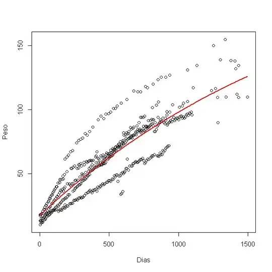
I have an equation to predict the weight of manatees from their age, in days (dias, in portuguese):
R <- function(a, b, c, dias) c + a*(1 - exp(-b*dias))
I have modelled it in R, using nls(), and got this graphic:
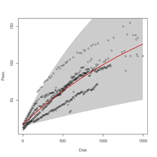
Now I want to calculate the 95% confidence interval and plot it in the graphic. I've used the lower and higher limits for each variable a, b and c, like this:
lower a = a - 1.96*(standard error of a)
higher a = a + 1.96*(standard error of a)
(the same for b and c)
then I plot a lower line using lower a,b,c and a higher line using higher a,b,c. But I'm not sure if that's the right way to do it. It is giving me this graphic:
Is this the way to do it, or am I doing it wrong?