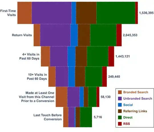
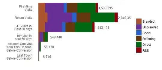
This plot displays a two-way contingency table whose data are approximately these:
                      Branded Unbranded Social Referring Direct   RSS
First-time...          177276    472737  88638    265915 472737 59092
Return Visits...       236002    629339 118001    354003 629339 78667
4+ Visits in ...       166514    444037  83257    249771 444037 55505
10+ Visit in ...        28782     76751  14391     43172  76751  9594
At Least One Visit...    6707     17886   3354     10061  17886  2236
Last Touch...             660      1759    330       989   1759   220
There are myriad ways to construct this plot. For instance, you could calculate the positions of each rectangular patch of color and separately plat each patch. In general, though, it helps to find a succinct description of how a plot represents data.
As a point of departure, we may view this one as a variation of a stacked bar chart.
This plot scarcely needs a description: through familiarity we know that each row of rectangles corresponds to each row of the contingency table; that lengths of the rectangles are directly proportional to their counts; that they do not overlap; and that the colors correspond to the columns of the table.
If we convert this table into a "data frame" or "data table" $X$ having one row per count with fields indicating the row name, column name, and count, then plotting it typically amounts to calling a suitable function and stipulating where to find the row names, the column names, and the counts. Using a Grammar of Graphics implementation (the ggplot2 package for R) this would look something like
ggplot(X, aes(Outcome, Count, fill=Referral)) + geom_col()
The details of the graphic, such as how wide a row of bars is and what colors to use, typically need to be stipulated explicitly. How that is done depends on the plotting environment (and so is of relatively little interest: you just have to look it up).
This particular implementation of the Grammar of Graphics provides little flexibility in positioning the bars. One way to produce the desired look, with minimal effort, is to insert an invisible category at the base of each bar so that the bars are centered. A little thinking suggests the fake count needed to center each bar must be the average of the bar's total length and that of the longest bar. For this example this would be an initial column with the values
254478.0 0.0 301115.0 897955.0 993610.5 1019817.0
Here is the resulting stacked bar chart showing the fake data in light gray:
The desired figure is created by making the graphics for the fake column invisible:
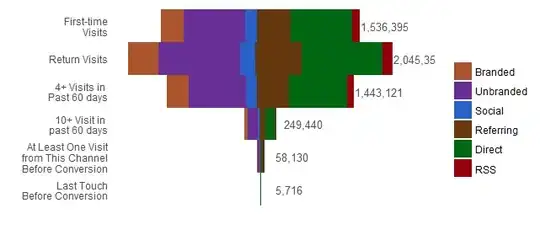
The Grammar of Graphics description of the plot does not need to change: we have simply supplied a different contingency table to be rendered according to the same description (and overrode the default color assignment for the fake column).
Comments
These graphics are honest: the horizontal extent of each colored patch is directly proportional to the underlying data, without distortion. Comparing them to the original (in the question) reveals how extreme its distortion is (Tufte's Lie Factor).
If it is desired to show details at the bottom of the "funnel," consider representing counts by area rather than length. You could make the lengths of the bars proportional to the square roots of the total lengths and their widths (in the vertical direction) also proportional to the square roots. Now the bottom of the "funnel" would be about one-twentieth the longest length, rather than one four-hundredth of it, permitting some detail to show. Unfortunately, the ggplot2 implementation does not allow one to map a variable to the bar width, and so a more involved work-around is needed (one which indeed describes each rectangle individually). Perhaps there is a Python implementation that is more flexible.
References
Edward Tufte, The Visual Display of Quantitative Information. Cheshire Press 1984.
Leland Wilkinson, The Grammar of Graphics. Springer 2005.