0

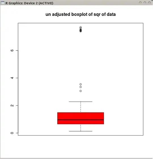
I am trying to present my data in a meaningful way. To do so, I thought it is a good idea to use a box and whisker plot, because, it shows min, max, median and skewness of data. However, due to variety in my data, I am getting a lot of outliers. For example, the many little circles are outliers. Is this bad?

boxplot with outliers

How about using a Standard Errors bar plot instead of a whisker bar plot as below?

standard error bars

In which case Standard Errors bar plot is preferable?

lofidevops
  • 111
  • 4
Co Koder
  • 153
  • 6
  • By whisker bar plot do you perhaps mean a boxplot? If the data are skewed it may be appropriate you re-express them - e.g. take the square or cubed root, or take the logarithm. See [Is there a boxplot variant for Poisson distributed data?](http://stats.stackexchange.com/q/13086/1036) for some example discussion. – Andy W Jan 19 '14 at 14:01
  • @AndyW Thanks, can you check out my question? i updated it. – Co Koder Jan 19 '14 at 17:24
  • 4
    Preferable for what purpose is the usual flip answer. In your case, there is no way I would prefer the mean +/- se plot. The cluster of outliers at about 7 on the displayed scale in the box plot is a very important detail and you can hardly make good decisions without working out how to think about them. Incidentally, I guess that the mean +/- se plot refers to quite different data, but you should clarify that. Regardless, a mean +/- se plot would hide the outliers, not a good thing for honest science or statistics. – Nick Cox Jan 19 '14 at 18:03
  • 1
    SPSS tag is puzzling. It seems you used R. – Nick Cox Jan 19 '14 at 18:07

0 Answers0