14

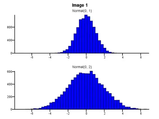
Let's say I have two distributions I want to compare in detail, i.e. in a way that makes shape, scale and shift easily visible. One good way to do this is to plot a histogram for each distribution, put them on the same X scale, and stack one underneath the other.

When doing this, how should binning be done? Should both histograms use the same bin boundaries even if one distribution is much more dispersed than the other, as in Image 1 below? Should binning be done independently for each histogram before zooming, as in Image 2 below? Is there even a good rule of thumb on this?

Image 1 Image 2

dsimcha
  • 7,375
  • 7
  • 32
  • 29
  • 5
    Q-Q plots are far better tools for incisive comparison of empirical distributions. Using them avoids the binning problem altogether. – whuber Mar 03 '11 at 16:32
  • 3
    @whuber: Agreed, if you just want a sensitive visualization of whether two distributions are different, but the histogram approach is IMHO better if you want detailed insight into **how** they're different. – dsimcha Mar 03 '11 at 16:34
  • 3
    @dsimcha My experience has been the opposite. The Q-Q plot clearly shows (in a quantitative way) differences of scale, location, and shape, especially in the thickness of the tails. (Try comparing two SDs directly from the histograms, for instance: it's impossible when they are close in value. On a Q-Q plot you need only compare slopes, which is fast and relatively accurate.) a Q-Q plot is inferior to a histogram in terms of picking out modes, but no histogram is good at that until a decent amount of data have been collected and a good choice of bins has been made. – whuber Mar 03 '11 at 16:52
  • 1
    I agree that QQ plots are the best solution, although they don't avoid the bin problem, they just force you to place the bins in particular places (the quantiles :-) On the other hand this does imply that the bins don't, indeed shouldn't be shared by the two distributions. – conjugateprior Mar 03 '11 at 18:40
  • 1
    @dsimcha, I think something like age/gender plots could be useful pictures. Anyway why to use histograms for this? Just plot distribution functions directly. However, if you are playing with empirical things, then QQ plot suggestion is the best choice. – Dmitrij Celov Mar 04 '11 at 09:24
  • @Dimitrij Using the EDFs (empirical [cumulative] distribution functions) is a nice idea. Moreover, there are reasons to choose between histograms (which essentially are empirical PDFs) and EDFs. See, for instance, http://stats.stackexchange.com/q/4810/919 . Thus your suggestion would solve the problem well in some cases but others really do need a histogram to be displayed. Yet isn't the *display* of a data distribution really separate from the question of *graphical comparison* of two distributions? – whuber Mar 04 '11 at 15:58

3 Answers3

7

I think you need to use the same bins. Otherwise the mind plays tricks on you. Normal(0,2) looks more dispersed relative to Normal(0,1) in Image #2 than it does in Image #1. Nothing to do with statistics. It just looks like Normal(0,1) went on a "diet".

-Ralph Winters

Midpoint and histogram end points can also alter perception of the dispersion. Notice that in this applet a maximum bin selection implies a range of >1.5 - ~5 while a minimum bin selection implies a range of <1 - > 5.5

http://www.stat.sc.edu/~west/javahtml/Histogram.html

Ralph Winters
  • 801
  • 5
  • 7
  • 1
    Could you provide some theoretical justification for this opinion? – whuber Mar 03 '11 at 19:46
  • No, just an opinion. But if I had time, I would start my research from the retail packaging world (thin body perception), and incorporate some of the work of Tufte. – Ralph Winters Mar 03 '11 at 20:59
  • @whuber: it is mostly related to the way our brain processes information. When there are smaller bins, our mind also "shrinks" the boundaries of the curve. Try inversing the size of the bins in fig. #2 to see what I mean. – nico Mar 04 '11 at 15:07
  • @nico Yes, there is a perceptual element to the question. But in the forefront is the statistical issue because it has a much larger influence: smaller bins ==> more sample variability in the bins ==> more "ragged" histograms ==> greater difficulty in comparison. Thus, IMO, any worthwhile answer should adduce support from *statistical* theory (at a minimum). – whuber Mar 04 '11 at 15:50
  • @whuber: I was referring to the fact that the distribution **look** differently dispersed in the two images. Of course how they look has nothing to do with how much they are really dispersed. – nico Mar 04 '11 at 16:07
  • @nico That sounds like a good argument for not using histograms when you want to compare dispersions! – whuber Mar 07 '11 at 18:00
  • @whuber: others may say it is a good argument in favour of using histograms with the same binning... but I am not going into that discussion, sorry! :P – nico Mar 07 '11 at 18:21
  • @nico @Ralph Maybe this has to do with a distinction between local and global information (contour) processing, but honestly I cannot really "see" such a difference in terms of apparent dispersion. It seems to me (but this has already been said) that binning (or window span in kernel density estimate) helps to spot multiple mode if any, not the overall shape. – chl Mar 07 '11 at 22:18
2

Another approach would be to plot the different distributions on the same plot and use something like the alpha parameter in ggplot2 to address the overplotting issues. The utility of this method will be dependent on the differences or similarities in your distribution as they will be plotted with the same bins. Another alternative would be to display smoothed density curves for each distribution. Here's an example of these options and the other options discussed in the thread:

library(ggplot2)

df <- melt(
    data.frame( 
        x = rnorm(1000)
        , y = rnorm(1000, 0, 2)
    )
)


ggplot(data = df) + 
#   geom_bar(aes(x = value, fill = variable), alpha = 1/2)
#   geom_bar(aes(x = value)) + facet_grid(variable ~ .)
#   geom_density(aes(x = value, colour = variable))
#   stat_qq(aes(sample = value, colour = variable))
Chase
  • 3,055
  • 2
  • 19
  • 28
  • Doesn't this just push the question down to the issue of selecting appropriate kernel widths and whether (and how) one can compare two smooths using different kernel widths? – whuber Mar 04 '11 at 15:53
  • 1
    @whuber - valid point. I wasn't trying to suggest density curves were the be all end all method to use, simply offering other alternatives. It is clear from this post that there are pros and cons to any approach, so was offering this up as another viable alternative to throw into the mix. – Chase Mar 04 '11 at 16:07
  • In light of that I'm voting up your answer, +1. – whuber Mar 04 '11 at 20:03
0

So it's a question of maintaining the same bin size or maintaining the same number of bins? I can see arguments for both sides. A work-around would be to standardize the values first. Then you could maintain both.

xan
  • 8,708
  • 26
  • 39
  • That would work when the two sample sizes are similar. But when they are dissimilar, the common bin size (even in standardized units) could be appropriate for one or the other histogram, but not for both. How would you deal with that case? – whuber Mar 03 '11 at 20:26
  • Maybe we're thinking about different meanings of standardize. I meant the one I linked to where, for instance, if one population has a stdev of 5 and the other has a stdev of 10, after standardization they would both have a stdev of 1. They could then be more fairly compared with the same bin size since each bin has a comparable amount of pixels and data. Or maybe you were getting at the larger issue that "appropriate bin size" is a bit of a black art and unique to every data set... – xan Mar 03 '11 at 22:21
  • We share the same meaning of "standardize." Choosing a bin size requires judgment and knowledge of context, but it's a stretch to characterize it as a "black art": see, for example, http://stats.stackexchange.com/q/798/919 . – whuber Mar 04 '11 at 15:52