Variography is part statistics, part science, and partly a practical art. Entire books (or major parts thereof) have been written about it, beginning with Journel & Huijbregts' Mining Geostatistics in 1978, so it will not be possible to do justice to this question in the space of one Web page. Let's just examine the issues briefly.
What a variogram does
A variogram is a sophisticated technical tool developed to cope with an oft-observed phenomenon in extensive spatial data: their covariance may appear to increase without limit as the distances among the data supports increase. If for conceptual and explanatory purposes we are willing to give up on that generality, then the variogram is mathematically equivalent to the covariance function. (The variogram looks like the covariance "turned upside down": zero corresponds to high correlation and positive values correspond to lower correlation.)
More specifically, when you use a variogram you are
electing to model your data as one realization of a spatial stochastic process and
assuming (at a minimum) that the first two moments of that process are the same everywhere ("second order stationarity").
As such, a variogram affords information similar to the autocovariance function (ACF) of time series, but (unfortunately) it cannot be used in quite the same way as in time series, because data in more than one dimension do not enjoy the implicit ordering available in one dimension (from past toward the future). Nevertheless, it can be exploited in a generalized least-squares setting to improve predictions at unsampled locations. This GLS predictor is called "Kriging" (after its discoverer, D. G. Krige).
Essential properties of variograms
Variograms are functions of spatial distance. Typically they start at some non-negative value and increase with larger distance. If they reach an asymptotic level, the amount they rise is called the "sill" and the distance at which that asymptote is reached (or nearly reached, according to some quantitative convention) is called the "range." They will be continuous except possibly at a distance of zero, where they may exhibit a jump by an amount called the "nugget." (I simplify a little, ignoring the distinction between a true nugget and iid measurement error.)
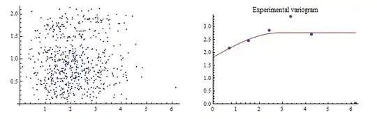
The right hand plot overlays an experimental variogram (point symbols) and a fitted variogram (red line) for a dataset of 50 observations. As explained below, the fitted variogram attempts to represent the experimental values near zero (on the horizontal axis) as well as possible. The left hand plot is the "point cloud": each point represents a pair of data plotted according to their distance (horizontal axis) and the fourth root of the squared difference in the data. (Fourth roots are helpful for exploring the data: although the variogram itself summarizes the squared differences within distance intervals, such squares are strongly skewed.) The fitted variogram--a "spherical" model--has a nugget of $1.75$, a sill near $1$, and a range of almost $3$.
The basic properties of a variogram, then, are its nugget, its range, its sill, and its limiting behavior as it approaches zero. The latter reflects the smoothness of the underlying stochastic process:
A positive nugget reflects local discontinuity. It is a kind of spatial "white noise" term. After all, since the nugget includes any independent measurement error, the value of an observation at one location ought to differ from the value of the process at that location (and at nearby locations).
A zero nugget models continuous processes. There are degrees of continuity. A process that is merely continuous but not differentiable would, if known perfectly at every location, appear quite jagged when graphed: but it would not have any jumps.
A process that is differentiable is smooth everywhere, without any jaggies. For such processes, the limiting value of the slope of the variogram at zero is zero.
It therefore is crucial to model the variogram at near-zero distances as well as possible. Substantial deviations between the fit and the data at large distances are acceptable (and almost inevitable).
Answers to the questions
... the resulting layer seems overly smoothed to me.
Kriging always smooths the data. Like all other interpolators (or predictors) it makes a good estimate on average. It does not attempt to reproduce all qualitative features of the process. An elementary example that gives good intuition is least squares regression: there, we fit a line to a football-shaped cloud of points. The line is a highly smoothed version of the data indeed!
A linear variogram (without nugget), because it has nonzero slope at zero, will represent a continuous but non-smooth process. If you wish to get a qualitative sense of what that process might really look like, you need to do spatial stochastic simulation, not kriging.
When I set my nugget and sill to zero the resulting layer matches almost perfectly at each station.
That always happens when the nugget is zero, because the variogram near zero will be close to zero, too, indicating that Tobler's Law is holding: everything is related, but near things are more closely related. We say that the interpolator "honors" the data. Such interpolators are wonderful in the idealized world of mathematics, but in most practical applications they are erroneous, because there always is some amount of measurement error. It's usually a good idea to abandon honoring-the-data as a useful criterion for assessing the goodness of an interpolated surface, because it creates a contrafactual illusion that the data are perfect.
Would it be wrong to set the nugget and sill like this?
The nugget, sill, range, choice of variogram shape, and other aspects of variography (such as whether to use an isotropic model, the type of neighborhood search to use, and so on) should be evaluated using such qualitative criteria, but only after fitting the variogram to the data. This means drawing an experimental variogram (which plots some measure of data dispersion as a function of the distances between them) and fitting a variogram model in a controlled way guided by knowledge of the physical phenomenon. "Controlled" refers to a great deal of things, ranging from initial exploration of the data, examination of outliers, consideration of the data distribution, taking out any deterministic "drift" terms, assessing variation in correlation with direction ("anisotropy"), evaluating the possibility of nonstationarity, and introducing auxiliary information such as covariates (elevation often is a critical covariate for kriging meteorological data) and even "soft" data like directions of prevailing winds.
Conclusion
This should make clear the sense in which statistics, science, and art (that is, understanding and experience) are intimately involved in the process. If any of the three is not used in developing the variogram, then the claims usually applied to kriged datasets--particularly that they are "best" or "unbiased" in any sense--will lack justification and you might be better off using simpler interpolators that do not require this level of care and knowledge.