In order to use a mixture of Gaussians for your problem, you have to assume that your three measurements are multivariate normal. In that setting, you have many measurements of a mixture of 3 dimensional normals, generated by k different underlying densities.
You could start by setting k=3, one for "/ shape", one for "/\ shape", and one for "-- shape" you mentioned having observed. This will allow you to model the underlying mixture distribution, estimate the covariance of each cluster and of course, classify all measurements. Before comparing them, I would also think about subtracting the mean (and potentially also scaling), since you probably don't care about the general level of an individual, but about the change.
Please provide some details where you found the information about the "quadratic curves" you are mentioning, or why you think the Gaussian mixture would classify your measurements using a linear boundary, if you wish to follow up on that. Based on my understanding, the results are labeled based on the likelihood of being generated by a particular density (one of the k you started with). I am not aware of any condition that would restrict the boundary to be a polynomial in the general approach, or even suggest it could be so for that matter.
EDIT (in response to your comment):
The order in your measurements will be captured, since you will encode the morning,afternoon, evening measurements for each individual as a 3dimensional, multivariate normal, with unknown mean and unknown covariance. Imagine there are 3 such Gaussians - one for each characteristic shape of the measurements.
A gaussian mixture model is called a "mixture" model since it presumes that the measurements come from a probability, which is some weighted combination of the three underlying Gaussians. Each measurement can have a different weighting.
When you fit the model, you need to infer the parameters of all three Gaussians and simultaneously, infer the responsibility (weighting) of each Gaussian for having generated a particular measurement.
If you find this concept too hard to understand, or if my explanation is completely incomprehensible I would suggest you try a much simpler and much more straightforward approach: k-means.
You simply take the $3xN$ table of data, stick it in a k-means function and set the number of clusters to be 3.
I have written a snippet in R to illustrate:
First I generate some data along the lines of your description.
library(MASS)
library(clue)
library(mclust)

# Generate training data
Sigma <- diag(3)
mu1 <- c(3,0,3)
mu2 <- c(0,0,0)
mu3 <- c(0,3,0)

group1 <- mvrnorm(n = 5, mu1, Sigma)
group2 <- mvrnorm(n = 5, mu2, Sigma)
group3 <- mvrnorm(n = 5, mu3, Sigma)

# Generate test data
new_measurements <- rbind(mvrnorm(n = 2, mu1, Sigma), mvrnorm(n = 2, mu2, Sigma),mvrnorm(n = 2, mu3, Sigma))
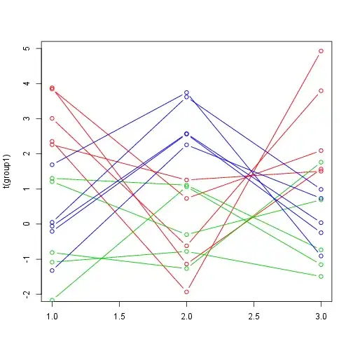
Here is what it looks like: (I labeled the measurements according to the Gaussian which generated them purely for visual convenience. In your case, your data is not labeled.)
# Plot training data and cluster
matplot(t(group1),type="b",col=2,lty=1,pch=1)
matplot(t(group2),type="b",col=3,lty=1,pch=1,add=T)
matplot(t(group3),type="b",col=4,lty=1,pch=1,add=T)
Now we can cluster the data using k-means, by setting the number of cluster to 3, since that is your intuition. (We could also try to investigate what is the right number of clusters using the data.)
# Cluster
data <- rbind(group1,group2,group3)
fit <- kmeans(scale(data), 3)
# get cluster means
cluster_means <- aggregate(data,by=list(fit$cluster),FUN=mean)
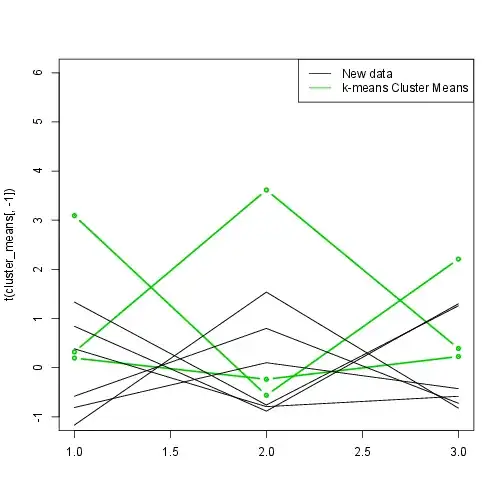
And we get the mean values for each cluster, which we can then use to make predictions for new measurements.
# Predict cluster
fit$centers
predicted_clusters <- cl_predict(fit,scale(new_measurements))
predicted_clusters
We get the means of the clusters,
        [,1]       [,2]       [,3]
1 -0.8618375 -0.6464979 -0.5279966
2 -0.3605748  0.9793615 -0.5128992
3  1.1221597 -0.6580355  1.0378763
as well as the predicted cluster for the our new measurements.
Class ids:
[1] 3 3 1 1 2 2
As you can see, k-means correctly predicted to which cluster they belong to, though the k-means estimations of the means are relatively far off. The third cluster corresponds to our first simulated Gaussian with means (3,0,3).
Lastly, we can plot the new data and the estimated means.
matplot(t(cluster_means[,-1]),type="b",col=3,lty=1,pch=20,lwd=2,ylim=c(-1,6))
matplot(t(scale(new_measurements)),type="l",col=1,lty=1,add=T)
legend("topright",legend=c("New data","k-means Cluster Means"),lty=1,col=c(1,3,4))