Try the examples under dendrogram. You can make it as interactive as you want.
require(graphics); require(utils)

hc <- hclust(dist(USArrests), "ave")
(dend1 <- as.dendrogram(hc)) # "print()" method
str(dend1)          # "str()" method
str(dend1, max = 2) # only the first two sub-levels

op <- par(mfrow= c(2,2), mar = c(5,2,1,4))
plot(dend1)
## "triangle" type and show inner nodes:
plot(dend1, nodePar=list(pch = c(1,NA), cex=0.8, lab.cex = 0.8),
      type = "t", center=TRUE)
plot(dend1, edgePar=list(col = 1:2, lty = 2:3),
      dLeaf=1, edge.root = TRUE)
plot(dend1, nodePar=list(pch = 2:1,cex=.4*2:1, col = 2:3),
      horiz=TRUE)
Edit 1 ====================================
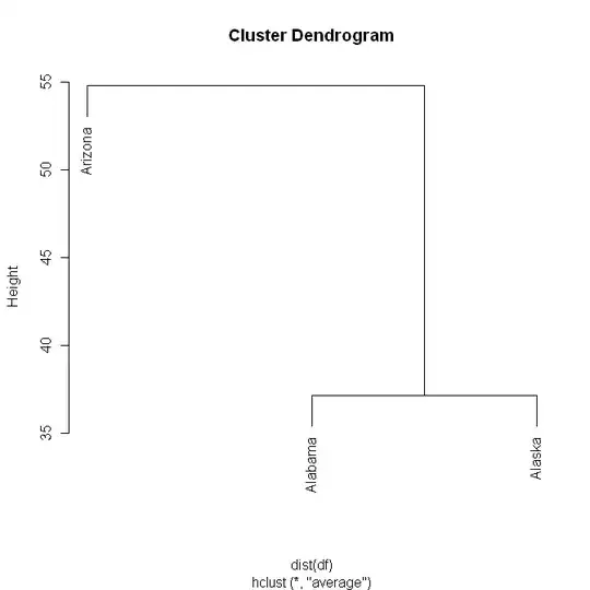
The interactivity depends on what you want to do. It all comes down to the structure of the data that goes to plot. To make it easier to see what's going on, I'll only use the first 3 lines of data from the above example:
#Use only the first 3 lines from USArrests
(df <- USArrests[1:3,])

#Perform the hc analysis
(hcdf <- hclust(dist(df), "ave"))

#Plot the results
plot(hcdf)

#Look at the names of hcdf
names(hcdf)

#Look at the structure of hcdf
dput(hcdf)
The next segment is the output of the above dput statement. This structure tells plot how to draw the tree.
structure(list(merge = structure(c(-1L, -3L, -2L, 1L), .Dim = c(2L,
2L)), height = c(37.1770090243957, 54.8004107236398), order = c(3L,
1L, 2L), labels = c("Alabama", "Alaska", "Arizona"), method = "average",
   call = hclust(d = dist(df), method = "ave"), dist.method = "euclidean"),
.Names = c("merge", "height", "order", "labels", "method", "call", "dist.method"),
class = "hclust")
You can easily change the data and see what plot does. Just copy/paste the structure statement from your screen and assign it to a new variable, make your changes, and plot it.
newvar <- structure(list(merge = structure(c(-1L, -3L, -2L, 1L), .Dim = c(2L, 2L)), height = c(37.1770090243957, 54.8004107236398), order = c(3L, 1L, 2L), labels = c("Alabama", "Alaska", "Arizona"), method = "average",     call = hclust(d = dist(df), method = "ave"), dist.method = "euclidean"), .Names = c("merge", "height", "order", "labels", "method", "call", "dist.method"), class = "hclust")

plot(newvar)
As far as making the clustering more interactive, you'll have to explore the different methods and determine what you want to do.
http://cran.cnr.berkeley.edu/web/views/Cluster.html
http://wiki.math.yorku.ca/index.php/R:_Cluster_analysis
http://www.statmethods.net/advstats/cluster.html
http://www.statmethods.net/advstats/cart.html