32

Is there a visualization model that is good for showing the intersection overlap of many sets?

I am thinking something like Venn diagrams but that somehow might lend itself better to a larger number of sets such as 10 or more. Wikipedia does show some higher set Venn diagrams but even the 4 set diagrams are a lot to take in.

My guess as to the final result of the data would be that many of the sets won't overlap so it is possible that Venn diagrams would be fine -- but I would like to find a computer tool that will be able to generate that. Its looks to me like Google charts doesn't allow that many sets.

Kyle Brandt
  • 737
  • 1
  • 6
  • 17
  • 1
    Related, but for small number of sets (for reference): http://stats.stackexchange.com/questions/4211/how-to-visualize-3d-contingency-matrix –  Jan 14 '11 at 12:51

3 Answers3

19

When you have a large number of sets, I would try something that is more linear and shows the links directly (like a network graph). Flare and Protovis both have utilities to handle these visualizations.

See this question for some examples like this:

alt text

Shane
  • 11,961
  • 17
  • 71
  • 89
  • (+1) Nice answer! - I especially like the graphics. I was wondering if there is a way to do this in R? – suncoolsu Jan 13 '11 at 22:37
  • 1
    I'm not aware of any way to do it; my webvis package provides a wrapper for Protovis, but it would be a lot of work to get it to make this graphic. Incidentally, this paper introduces the "arc diagram" which is related: http://ieg.ifs.tuwien.ac.at/~aigner/teaching/ws06/infovis_ue/papers/arcdiagram_01173155.pdf – Shane Jan 14 '11 at 04:10
  • 1
    @suncoolsu , the R package diagram may be able to do the same "arc diagram" Shane pointed to. It looks like it would be hard work though to get the "plot web" to look like the visual above though. http://cran.r-project.org/web/packages/diagram/vignettes/diagram.pdf . – Andy W Jan 14 '11 at 13:13
  • and Andy. Thank you for your answers. @Shane, I have seen your webvis package. But I still need to explore it further. I do like protovis graphs a lot. They have a great website. – suncoolsu Jan 14 '11 at 14:15
  • @suncoolsu Regretfully, the package is far from "complete" and I have very little time to spend on it. Maybe one of these days. I'd love to expose things like the above graphic so that they would be trivial to create. – Shane Jan 14 '11 at 14:34
  • 3
    Nice graph, but it doesn't answer the initial question, as you can't represent the intersection of 3 or more sets. Is there a variant of it that does ? – nassimhddd Jul 17 '12 at 14:49
  • It would be great if you give a basic output of the command with two example sets. – Léo Léopold Hertz 준영 Nov 18 '16 at 16:43
11

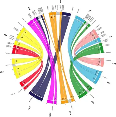
This won't compete with @Shane's answer because circular displays are really well suited for displaying complex relationships with high-dimensional datasets.

For Venn diagrams, I've been using the venneuler R package. It has a simple yet intuitive interface and produce nifty diagrams with transparency, compared to the basic venn() function described in the Journal of Statistical Software. It does not handle more than 3 categories, though. Another project is eVenn and it deals with $K=4$ sets.

More recently, I came across a new package that deal with higher-order relation sets, and probably allow to reproduce some of the Venn diagrams shown on Wikipedia or on this webpage, What is a Venn Diagram?, but it is also limited to $K=4$ sets. It is called VennDiagram, but see the reference paper: VennDiagram: a package for the generation of highly-customizable Venn and Euler diagrams in R (Chen and Boutros, BMC Bioinformatics 2011, 12:35).

For further reference, you might be interested in

Kestler et al., Generalized Venn diagrams: a new method of visualizing complex genetic set relations, Bioinformatics, 21(8), 1592-1595 (2004).

Venn diagrams have their limitations, though. In this respect, I like the approach taken by Robert Kosara in Sightings: A Vennerable Challenge, or with Parallel Sets (but see also this discussion on Andrew Gelman weblog).

chl
  • 50,972
  • 18
  • 205
  • 364
  • It looks good. i would have loved it if it would accept non numericals. It seems one has to transform their data to a numerical list first. – eastafri Apr 12 '11 at 12:33
  • For practical purposes, it would be awesome to include some screengrabs – stevec Feb 03 '19 at 05:27
9

We developed a matrix-based approach for set intersections called UpSet, you can check it out at http://vcg.github.io/upset/. Here is an example:

UpSet Screenshot

The Matrix on the left identifies the intersection a row represents, the last row here, for example, is the intersection of the "Action, Adventure, and Children" movie genres. The bars to the right show you the size of the intersection, 4 in this example.

You can also plot attributes of the intersections or other selections, etc. Check out the website for details.

There is now also a static version for R which you can find on the website mentioned above, or by going here: https://github.com/hms-dbmi/UpSetR/

A state of the art report on set visualization is accessible at http://www.cvast.tuwien.ac.at/SetViz - most of these are academic though and don't come with readily available code.

alexsb
  • 199
  • 1
  • 3
  • 1
    As for me the image you posted is rather an example of overplotting, with too much information packed up on a single plot... – Tim Jul 21 '15 at 11:46
  • 1
    @Tim. While I understand what you're saying, it isn't really overplotting as all visual elements are clearly visible and separated. You could argue the plot is too complex to readily discern but this could just as well be related to you not being trained in using the plot - not all visualizations can or should be aimed at untrained users, as simplifications often lead to limited scope (e.g. poor scalability of venn diagrams) – ThomasP85 Nov 25 '15 at 09:26
  • @ThomasP85 there was much research that shows that people are really *bad* in visual interpretation of plots (even "the" experts) including even such basic stuff like pie charts. In most cases complicated visualization leads to misinterpretations and misunderstandings. – Tim Nov 25 '15 at 09:33
  • @Tim I agree that simple is always better, but complex questions sometimes have complex answers. The reason this question was posed in the first place is that there, to this date, isn't a compelling, simple visualisation technique to deal with large numbers of set intersections. The accepted answer only concerns itself with 2-degree intersects which, as the number of sets increase, are a smaller and smaller part of the total number of intersects. – ThomasP85 Nov 25 '15 at 09:38
  • ... and your example with pie charts are related to the fact that humans (expert or not) are horrible at comparing angles, which is why pie charts should never be used :-) – ThomasP85 Nov 25 '15 at 09:40
  • Also, the fundamental part of this chart is only a matrix that identifies the set combination and the bar charts. Here are examples of the simplest version: https://goo.gl/QL1jTB This does exactly what a venn diagram can do. The deviation plots and the box plots show data that you couldn't sensibly plot in a venn diagram, but you don't have to use that. – alexsb Nov 30 '15 at 23:54