11

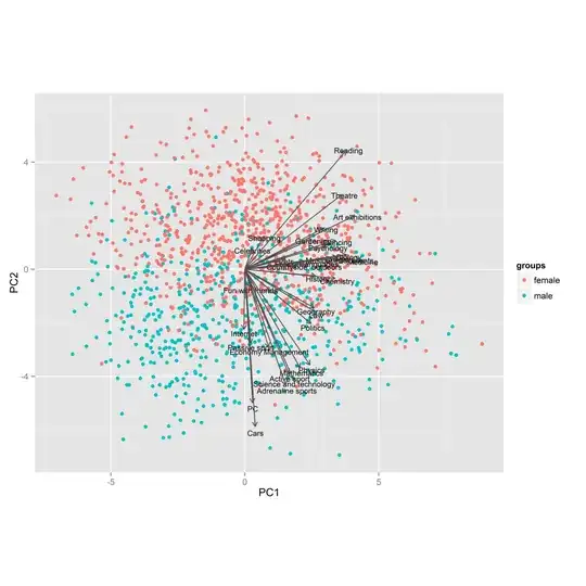
Background: I asked hundreds of participants in my survey how much they are interested in selected areas (by five point Likert scales with 1 indicating "not interested" and 5 indicating "interested").

Then I tried PCA. The picture below is a projection into first two principal components. Colors are used for genders and PCA arrows are original variables (i.e. interests).

I noticed that:

  • Dots (respondents) are quite well separated by the second component.
  • No arrow points left.
  • Some arrows are much shorter than others.
  • Variables tend to make clusters, but not observations.
  • It seems that arrows pointing down (to males) are mainly males' interests and arrows pointing up are mainly females' interests.
  • Some arrows point neither down nor up.

Questions: How to correctly interpret relationships between dots (respondents), colors (genders) and arrows (variables)? What other conclusions about respondents and their interests can be mined from this plot?

The data can be found here.

PCA analysis

amoeba
  • 93,463
  • 28
  • 275
  • 317
sitems
  • 3,649
  • 1
  • 25
  • 52
  • What do you think the first PC represents? The overall level of interest of the respondent? – Placidia Jun 08 '13 at 17:08
  • This picture is _PCA's biplot_. Recommend you to search the term to read how to interpret it. In short, it is both PC's scores and the variable loadings shown (juct for conciseness) on the same picture. See also my explaining [pictures](http://stats.stackexchange.com/a/50610/3277). It is clear on your pic, that PC2 is mostly gender heterogeneity dimension defined most strongly by 2 variables: Care + another one I can't discern. – ttnphns Jun 15 '13 at 07:13
  • @MiroslavSabo: I like your plot because it shows that men and women do not form two separate clusters (with respect to their interests), but actually form a spectrum. I suppose you were preparing a research paper; has it been published? is it still going to be? – amoeba Jan 29 '14 at 22:02
  • @amoeba, thank you a lot for your interest. However, I was only interested in this plot without any plan to publish that results. But if you want to, we could publish it together. – sitems Jan 30 '14 at 08:38
  • @MiroslavSabo: you surveyed *hundreds of participants* just to make this plot, without any plan to publish the results? Wow, respect! Seriously. – amoeba Jan 30 '14 at 10:35
  • @MiroslavSabo did you find more conclusions about the interpretation of your PCA's biplot? can you share this? I ask you because I got very similar results with my data, and I would like to know what means that all variables are in one half of the graph drawing a semicircle? – Darwin PC Dec 30 '15 at 22:32
  • @DarwinPC, I have not studied the data in depth, so everything I know is in this post. – sitems Dec 30 '15 at 22:39
  • 1
    @amoeba The data from the post (together with other items in the questionnaire) is now [public](https://www.kaggle.com/miroslavsabo/young-people-survey). – sitems Aug 23 '16 at 21:05
  • 1
    @DarwinPC The data from the post (together with other items in the questionnaire) is now [public](https://www.kaggle.com/miroslavsabo/young-people-survey). – sitems Aug 23 '16 at 21:06

1 Answers1

8

The dots are the respondents and the colours are the genders. This, you know. The principal axes of your plot represent the first and second PC scores and individuals are plotted on that basis. Somebody in the lower left hand quadrant got low scores on both. PC2 seems to flag "male" and "female" interests. I don't know what PC1 means, but it probably represents an overall interest score -- people with lots of interests score high. Or perhaps it represents people with passionate interests (score 5).

The vectors are a projected coordinate system for the original variables. So if you project a point perpendicularly onto, say, the reading vector - you should get the reading score of that person. Relative position is important here.

Take a "male" vector like "adrenaline sports". Now imagine that you project a pink spot onto it from high in the upper right quadrant. That person's co-ordinate on "adrenaline sports" will be negative.

So why are the arrows all in the right half of the graph? Given the geometry, the deeper a person is into the left side of the graph, the fewer of their projections will be positive. This suggests that PC1 is a measure of overall interest level.

I'm not sure what else you could learn here. You might want to look at PC3 and PC4, if PC1 and PC2 only tell you that some people have more interests than others and that men are different from women.

Your plot seems almost symmetric around the PC1 axis, and symmetric with respect to gender. As many men have female interests as women have male interests ... or is that true? I'm just looking at the dots. It might be interesting to look at areas where the map is not symmetric: large PC1, moderately negative PC2 --- that sector has a lot of action. Why?

Nick Cox
  • 48,377
  • 8
  • 110
  • 156
Placidia
  • 13,501
  • 6
  • 33
  • 62
  • Could you possibly give me your thoughts on my biplot? I'm having a hard time interpreting it. Thank you. https://stats.stackexchange.com/questions/276421/interpreting-pca-biplots – Seanosapien Apr 28 '17 at 12:45