You are right to think that a correlation of .46 suggests that one variable could have some merit as a proxy for the other. However, there is no reason to expect that there is a threshold to be found anywhere nor is it very clear how this would help you achieve your goal.
Interpreting correlations
The first thing to consider is that a given correlation coefficient can hide many different situations. Consequently, the most useful thing to do to determine if you can use the average time-on-page to detect unrelated searches is to look at the data directly. A scatterplot is a good way to do this. In Excel, you can find it under the name “X Y (Scatter)”. You would then obtain something like this:
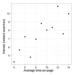
In this case, the correlation is high (.8) and we have a pretty clean linear relationship: If related searches are low, average time-on-page is low as well and conversely if related searches are high, average time-on-page is high. Such a linear relationship can be represented by a straight line:
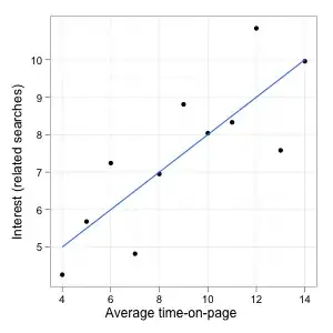
A correlation coefficient quantifies the strength of the relationship, how much the value of one variable tells us about the value of the other or how far apart the points spread around the line. Since in this example the correlation is very high, knowing the time-on-page would allow you to make a good guess regarding the level of the related searches because you know that the actual point is not likely to be very far from the line (your guess), which is good for your purpose.
At the same time, the relationship is also more-or-less the same everywhere. There is no obvious threshold, no point at which time-on-page and searches are not correlated anymore. If you would compute a correlation coefficient on part of the range of potential time-on-page (e.g. considering only pages where people spend less than some fixed time), it would be lower than one computed on the whole data set but this does not imply anything about the relationship being different (this is sometimes known as “range restriction”). Still, if your data do in fact look like this, you could definitely use time-on-page to screen for potential problems as picking pages with low time-on-page would allow us to find pages with low related searches. You just need to set the cutoff point differently (more on that later).
However, a .8 correlation coefficient can also look like this:
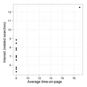
(This example and the first one are based on a group of famous data sets known as Anscombe's quartet.)
The stats are superficially similar (same mean, same standard deviation, same equation in a least square regression, same correlation) but the plots show that two examples are completely different. In the second one, the correlation is entirely driven by the lonely observation on the top right of the graph. For the rest of the data, time-on-page provides absolutely no information on the level of interest in the page. Even though there is a correlation when looking at the whole data set (much stronger in fact than the one in your data), the first variable is not very useful to guess the second one, at least apart from that one point on the right.
Of course, this is but one example but this shows how a high correlation coefficient does not necessarily imply a simple or useful relationship. If you want to use this correlation in one way or another, it's always useful to plot the data and try to understand the relationship between the variables graphically.
Correlations and thresholds
Now, let's look a little more at potential thresholds. In the first example, the relationship was the same along the whole range of the variables but it's also entirely possible that the correlation changes above some threshold. One way this could happen is like this:
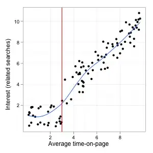
Here, there is a clear threshold around 3 (the data were generated randomly for the sake of the illustration, the units don't mean anything). After that, both the average time-on-page and the related searches go up. Setting the cutoff at 3 would identify all the worse pages, so it would presumably be a good criterion.
The problem is that before this point the correlation is basically 0 (in this particular data set it's even slightly negative by chance) and after that it becomes very high. Trying to find a cutoff point below which the correlation is highest will not help us identify this particular threshold.
The situation you had in mind is perhaps more similar to this plot:
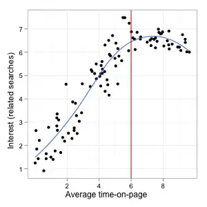
First, there is a positive linear relationship and longer time-on-page means higher related searches, then this relationship levels off and beyond 6 or so, all the pages have broadly the same level of interest. The correlation is also highest to the left of the cutoff and null or negative beyond that point.
But this threshold does not seem particularly helpful for your purposes: It would lead you to select more than two third of all pages, including some of the best ones and many with a lower but still decent level of related searches. It would probably make more sense to stop at 2 or 3 and catch all the really bad pages even though it's nowhere near the threshold.
Finally, an interesting case:
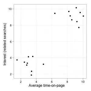
On this plot, we clearly have two distinct groups of pages (good and bad) with a big difference in related searches, a clean separation and an obvious threshold to identify them through average time-on-page. The correlation on the whole data set is also very high (.9), so it looks like a no brainer. The funny thing is that correlations between data points on the left or on the right of the threshold taken in isolation are both small and negative. The correlation only becomes unambiguously positive if you include points from both groups. Maximizing correlations based on some cutoff value would therefore not be helpful at all (minimizing could however).
How to set a cutoff point, then?
I don't see any particular reason why the cutoff should be driven by the relationship between time-on-page and related searches/keyword ratio. There is a clear hierarchy in the variables: The second one is the only one you care about, the first one is only a proxy or a way to predict it with less effort than actually compiling the searches. So the most natural thing to do is to set a cutoff point based on the latter measure and define an acceptable level for the ratio of related to unrelated searches (possibly by looking at thresholds in this distribution, at outcomes you care about like conversion or user satisfaction, or more generally based on your expertise). Once you have that, you can try to find the corresponding time-on-page level by using a model or empirically using the plot.
You could also look at all this completely differently: Instead of defining an acceptable keyword ratio, start with the volume of pages you can possibly process (evaluate or rewrite). Then, order them by average time-on-page and look at the X% with the shortest time-on-page. You have no particular guarantee that those will be all the pages with a poor level of related searches but, provided the scatterplot on your first sample does not look too bad, they should be more likely to need improvements and since you cannot process more than that, there is no point in looking further.
One thing to look out for in the scatter plot is anything resembling an inverted U curve or a curve going up and down. If that's the case, all these approaches are completely wrong because one way or another you will only look at low average time-on-page pages and miss the bad pages with a high average time-on-page (perhaps because they are puzzling or misleading users into thinking the relevant material is there whereas it isn't, etc.)
A side-note on aggregating visit durations
Another thing you didn't ask about but that is worth mentioning is that aggregating individual time-on-page measures is not as straightforward as it might seem. In particular, time distributions tend to have an asymmetrical shape so that some extreme observations can drive the differences between mean time on different pages and have much more influence than the number of people who spend a short time on it.
If you consider a scenario in which a proportion of people are not interested and leave immediately while the rest spends a variable amount of time on the page, you can easily imagine a situation in which the vast majority leave after a few seconds but the mean is several minutes because a handful of readers find the material very interesting and read it for an hour or more (if 59 leave immediately and 1 reads for 60 minutes, the average – technically the arithmetic mean – is still one minute). Since an average time of a few minutes looks like that of a moderately interesting page where everybody spends between 1 and 5 min, you would miss the fact that most visitors landing on this particular page actually do not find it interesting at all.
The median or the proportion of visitors spending less than x seconds on the page would be less sensitive to this type of effects and can also be computed in Excel. It is also possible that the relationship with the keyword ratio would then be even stronger.