1

Very simply, I'd like to plot a graph that compares what is predicted by the model to the real observations.

It seems easy for binomials, but for multinomial the graph that SPSS creates is pretty ugly, using X and O signs rather than real graphics.

Any clue?

Here's the kind of plot SPSS makes by default. Not very beautiful nor understandeable in one glance, for a non-expert:

Image

gung - Reinstate Monica
  • 132,789
  • 81
  • 357
  • 650
Kevin
  • 13
  • 2
  • 7
  • I don't have access to SPSS. Can you post the figure to something like [imgr](http://imgur.com/), and describe your situation, your data & your model? – gung - Reinstate Monica May 18 '13 at 14:12
  • @gung: I was just doing it while you answered :) I edited my original question. – Kevin May 18 '13 at 14:16
  • Thanks, can you give some context? What are your data? What is your model? etc. – gung - Reinstate Monica May 18 '13 at 14:20
  • @gung Sure, my dependant variable is a probability that a firm gives a dividend in year t, and the independant ones are the size of the firm (market cap), its Return On Assets, its dividend history,... Basically, I'm just searching to include one graphical result of my regression results. Frequencies of right predictions, or plot of real observations against the line of the predicted regression, etc. Very simple ones, I just need a graphic argument to add to my report. – Kevin May 18 '13 at 14:24
  • 1
    What do you mean that your "dependent variable is a probability"? W/ multinomial LR, the DV is a nominal category w/ >2 possibilities. – gung - Reinstate Monica May 18 '13 at 14:29
  • @gung Sorry, I'm mixing the terms, I mean multivariate, not multinomial. In the sense that there are more than two independant variables in the model. The dependant variable is just 1 or 0. – Kevin May 18 '13 at 14:33
  • Well that does make a big difference... So you have a multiple LR model w/ 3 predictor variables (Mcap, ROA, hist), is that right? Are all of them 'significant'? Do you think they're all important (eg, to the story you're telling)? Are there interactions? – gung - Reinstate Monica May 18 '13 at 14:37
  • @gung More than 3 independant: 5. And only two of them have a significant coefficient. Writing this make me realise that I might then make a graph with just these two variables. I'll first check if they explain a big part of the variance. – Kevin May 18 '13 at 14:41
  • Are there any interactions? For those variables that are not 'significant', do you believe they're relevant? Eg, is it likely that they are non-significant simply due to low power? Can you provide the model equation (ie, coefficients)? – gung - Reinstate Monica May 18 '13 at 14:44
  • @gung I didn't try any interaction as this goes beyond of my skills: I just tested multicollinearity and there are no multicolinear values, so no redundant variables.The variables that are not significant should be, according to the litterature. Some of them can be explained though by the fact that my sample is very special. But the others I don't know why. I would prefer not to provide the datas, as I have not handed in my work yet. I am just coming to find a potential graph I could make, and i feel you help me with the entire anlysis (which is fantastic, but we should discuss it in private) – Kevin May 18 '13 at 15:06

1 Answers1

1

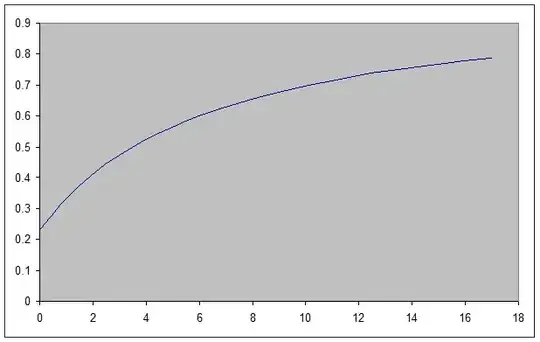
In my opinion, a good way to understand a model is just to plot it. This is as true for logistic regression as for standard linear regression. If you don't have any interactions, you can present each variable independently. (After all, the lack of interactions means the model is assuming the effect of each variable is independent of each other variable.)

I don't know how to get SPSS to produce these plots, although I'm sure it can be done. Nonetheless, a good fallback is to be able to produce plots in Excel. You will want to start by entering the names of the variables into cells A1 through A6 (i.e., "intercept", "Market Cap", "RoA", "History", etc.), and entering the estimated values in the corresponding cells B1 through B6. You'll also want to enter the means and labels for each variable at the top somewhere.

Further down the worksheet, you'll have 2 columns for each variable. In the left column (e.g., A), enter a series of values that spans the range of a variable (e.g., market capitalization). In the column to its right, write a function that will output the predicted probability given the variable value to the left and your model. Remember that the logistic regression model is: $$ \hat p_i=\frac{\exp\!\big(\beta_0+\beta_1\text{Mcap}+\beta_2\text{RoA}+\beta_3\text{hist}+\beta_4X_4+\beta_5X_5\big)}{1+\exp\!\big(\beta_0+\beta_1\text{Mcap}+\beta_2\text{RoA}+\beta_3\text{hist}+\beta_4X_4+\beta_5X_5\big)} $$ For the values of all the variables other than the one you are working on, use the mean of that variable. For instance, when you are getting predicted probabilities as a function of market capitalization, use the mean of RoA, etc. Once you have two columns of corresponding values for X & Y, you can plot them. Use Excel's chart wizard, and select "scatterplot" $\rightarrow$ "smooth lines without markers".

Here's a quick example:

enter image description here

gung - Reinstate Monica
  • 132,789
  • 81
  • 357
  • 650
  • It may also help you to read some of my other answers. This is especially close: [graphing a probability curve for a logit model with multiple predictors](http://stats.stackexchange.com/questions/31597//31600#31600). For a more general understanding of LR, these might help you: [interpretation of simple predictions to odds ratios in logistic-regression](http://stats.stackexchange.com/questions/34636//34638#34638), & [difference-between-logit-and-probit-models](http://stats.stackexchange.com/questions/20523//30909#30909). – gung - Reinstate Monica May 18 '13 at 17:49