0

I am currently trying to understand mixed effect models. And I would like to ask for some help understanding these results.

The data that I have is the mass volume of different rats across different days. Each rat has different time points where they took the measurement of that volume. There are 6 rats with volume measurements and 2 groups 3 rats came from Chile and 3 from England.

So the model is:

 m1 <- lmer(lVolume ~ Country*Day + (1|Rat))

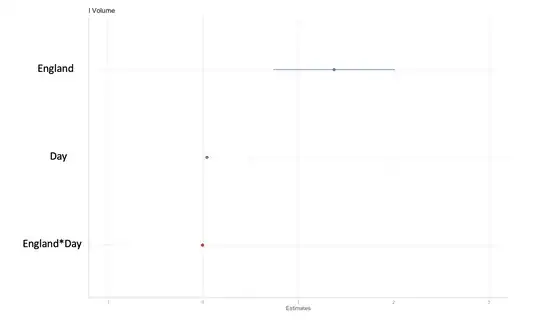
I am trying to understand how I can interpret the results from these plots:

enter image description here

***Update ***

I plotted the estimates:

Fixed parameters betas: 

  coeff <- fixef(m1)[2] :  

PassageChile 
         0.0458
  (respectively for England*Day)

Random parameters :

coeff <- sqrt(VarCorr(m1)$Rat[1])

To see left plot (similarly for the right one just changes the coeff and conf_int):

ggplot(df, aes(x = Set_Rat_1, y = coeff, color = Country)) + 
      geom_point(show.legend = FALSE, size = 3, 
      position = position_dodge(0.5)) + 
      geom_errorbar(aes(x = Set_Rat_1, ymin = Lower_confidence, 
      ymax = Upper_confidence), width = 0.2, 
      position = position_dodge(0.5), show.legend = FALSE) + 
      scale_shape_manual(values = cols) +
      labs(x = "Set_Rat_1", y = "FE", title = "Set Rat 1") +
      theme_bw()  

In addition, I got this but how do interpret these single points in terms of fixed effect, random effect and volume growth?

df.plot = ggpredict(model = m1,
                    terms = "Day",
                    type = "fe")

ggplot(data = df.plot,
       mapping = aes(x = x, 
                     y = exp(predicted),
                     ymin = exp(conf.low),
                     ymax = exp(conf.high))) + 
  geom_ribbon(fill = "lightblue") +
  geom_line(size = 1)

plot_model(
  m1, 
  bpe = "mean",
  bpe.style = "dot",
  prob.inner = .4,
  prob.outer = .8
)

enter image description here

enter image description here

In that sense,
a) I would like to interpret these plots with the model, what this single value in each country is telling me for both the fixed effect and the random effect.
b) Is there a way to check the significance between these 2 points from the fixed effect and the 2 points from the random effect?
c) Also, when I include more rats and plot the predictions from the m1 model, you can kind of notice a clustering in the growth, is there a statistical way to check that or the lmer tells you about this in some of the parameters?

enter image description here

This is partial data that the model uses:

For rat 1 I have volume c(78, 304, 352, 690, 952, 1250) at days c(89, 110, 117, 124, 131, 138) that belong to country Chile.

For rat 2 I have volume c(202, 440, 520, 870, 1380) at days c(75, 89, 96, 103, 110) that belong to country Chile.

For rat 3 I have volume c(186, 370, 620, 850, 1150) at days c(75, 89, 96, 103, 110) that belong to country Chile.

For rat 4 I have volume c(92, 250, 430, 450, 510, 850, 1000, 1200) at days c(47, 61, 75, 82, 89, 97, 103, 110) that belong to country England.

For rat 5 I have volume c(110, 510, 710, 1200) at days c(47, 61, 75, 82) that belong to country England.

For rat 6 I have volume c(115, 380, 480, 540, 560, 850, 1150, 1350) at days c(47, 61, 75, 82, 89, 97, 103, 110) that belong to country England.

Rachel
  • 63
  • 5
  • How to interpret the estimates and the p values in the stats table from the lmer model ? This is quite hard.... – Rachel Feb 26 '22 at 22:08

2 Answers2

1

When you have an interaction you have to be very careful when interpreting "fixed effect" coefficients even if there aren't random effects. With default coding in R, the (Intercept) is the estimate when all categorical predictors are at their reference levels (here, country of Chile) and continuous predictors are at 0 (here, Day = 0).

The coefficient for England is the difference from Chile only when Day = 0! That doesn't seem to be a situation of much practical interest in your study. There isn't much point to interpreting a plot of that form of your fixed effect for England

The coefficient for Day is the change per day for Rats from Chile. That assumes a linear change in "mass volume" per day. Your plots suggests that isn't a very good assumption for your data.

The England:Day interaction is the extra change per day for Rats from England over those from Chile. Again, the linearity assumption seems hard to support here.

All that the p-values in your table indicate is whether the corresponding coefficient is significantly different from 0. With interactions you typically want instead to examine differences among realistic combinations of conditions. For example: do Rats from Chile have different "mass volumes" than those from England at Day = 100? That requires extra calculations based on the coefficient estimates and their standard errors. I find the emmeans package to be helpful for performing that type of calculation with associated standard errors and p-values.

With a simple (1|Rat) random effect, the random effects are estimates of the variance of the differences of the individual rats from the overall (Intercept) value. Your model imposes a Gaussian distribution on those intercepts and doesn't allow for any further differences in terms of Country or Day (or their interaction) among the Rats. Thus for an individual Rat you would just add the corresponding fixed effects of Country and Day (including the interaction) to that individual's intercept.

You'd have to use other methods to look for clustering among Rats. The clustering might in part be due to predictors that you have omitted from the model, such as sex (if your Rats weren't all the same sex). I'd recommend evaluating such omitted predictors first.

EdM
  • 57,766
  • 7
  • 66
  • 187
  • Thank you very much! So but for example, in the plot with confident intervals, they overlap in both countries, so does that mean that there is no statistical significance of the beta values of each country? And,also regarding the plot of the ¨cluster behaviours¨ is there a way to kind of squeeze the lmer model and determine if there are ¨hidden cluster¨ within the model ? – Rachel Mar 03 '22 at 19:22
  • @Rachel overlapping confidence intervals only bear rough relationships to "significance" differences. See [this page](https://stats.stackexchange.com/q/18215/28500). The `England` coefficient in the table near the end shows p < 0.001, for a significant difference from `Chile` when `Day = 0`. The interaction term, however, suggests that the difference becomes smaller over time. I don't know of a way to "squeeze hidden clusters" out of an `lmer` model. I wouldn't do that with this model anyway, as the assumption of linear changes with `Days` is incorrect according to your plots at the bottom. – EdM Mar 03 '22 at 19:50
1

I suggest doing this, for starters:

library(emmeans)
RG <- ref_grid(m1, tran = "log", at = list(Day = c(100,200,300,400,500))
emmip(RG, Country ~ Day)

(or whatever Day values are most important.) The plot will show a line for each country, and having tran = "log" in there gives you the flexibility to undo the log transformation later that you apparently applied to the response variable.

One useful way to think about the model you have is that there are two non-parallel lines. You can use something like

emmeans(RG, ~ Country | Day)
pairs(.Last.value)

To view estimates (on the log scale) and comparisons thereof. If you want to see those on the original response scale, add the argument type = "response" to the emmeans() call.

Another thing you can do is compare the slopes of those two lines:

emtrends(m1, ~ Country, var = "Day")
pairs(.Last.value)

I recommend looking at some of the vignettes in the emmeans package, especially in this case the one on interactions.

Finally, I should be remiss not to mention that you should check that the model fits reasonably well. For example,

plot(resid(m1) ~ Day)

If you see any curvature there, it may be appropriate to choose a more complex model that models that.

Russ Lenth
  • 15,161
  • 20
  • 53