1

I'm graphing a regression in Stata with a dummy variable, but my results look like this, which makes sense because obviously the dummy variable is either 1 or 0. But s there a better way to graph this result? This is my current code:

graph twoway scatter rating_value late_ind
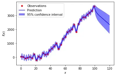
enter image description here

Alexis
  • 26,219
  • 5
  • 78
  • 131
  • Perhaps use a bar chart for categorical variables? – Alexis Feb 14 '22 at 17:54
  • https://stats.stackexchange.com/questions/507896. Check out other forms of visualization, too, including side-by-side boxplots, violin plots, bean plots, etc. – whuber Feb 14 '22 at 17:58

0 Answers0