I am wondring about the use of boxplots versus mean with 95 % in a figure? A boxplot will give you median and you can add a notch to show the 95 % CI for the median so it is quick and easy to compare different samples and if the CI overlaps. Mean with 95 % CI will give you almost the same, but the data must have a normal distribution and you don't get information about quartiles and outliers? Any advantages of boxplots compared to mean + 95 % CI? Any thoughts about the topic? :)
-
1Why should the *data* need to be normally distributed? What needs to be normally distributed for standard formulas for the CI to make sense is the *estimated mean*, and that is often normal even for very non-normal data. https://stats.stackexchange.com/q/466360/1352 – Stephan Kolassa Feb 10 '22 at 11:37
1 Answers
If you only plot the mean and the confidence interval, this will emphasize this particular measure of central tendency, and the associated uncertainty. However, what gets lost is the spread of the original data. Yes, one could argue that this spread is implicitly shown by the width of the confidence interval, but especially for larger sample size, the CI gets so small that readers will severely underestimate the dispersion of the original observations.
Why is this important? I observe very often that people, especially scientists nominally trained in statistics, overemphasize statistical significance (i.e., the width of CIs) compared to "clinical" significance (i.e., the spread of the data). Yes, an intervention may have a significant effect, $p<0.05$, and plotting the means and CIs shows nice non-overlapping CIs between the treatment and the control group... but the sample size is large, and the original observations shows a lot of variation, so that if you pick random individuals from both groups, you might find that the chance of the "treatment" individual to score better than the "control" one might be far closer to 50% than the significant mean differences would suggest.
Essentially, I am saying that plotting means and CIs alone leads us to be too sure of the effect we are studying, and to too little humility.
Here is an example (R code at the very bottom): let's plot the mean and the CI for $n=50$ observations.
Test yourself: can you give a range within which 50% of the data fall? Or alternatively, give 25% and 75% quantiles, all based on the mean and the CI? After all, if I additionally tell you that the data are normally distributed (which is not necessary), and you also know that $n=50$, you have all the information you need!
I will bet that most people you show this example to will severely underestimate the true spread of the data.
Also, note that how well you do on this little exercise will depend heavily on the plotting limits of our little figure. If we plot the mean and CI from $x=-1$ to $x=1$, we will get far narrower estimates of the original spread than if we plotted from $x=-4$ to $x=4$ - of course, always plotting the correct mean and CI. This is problematic.
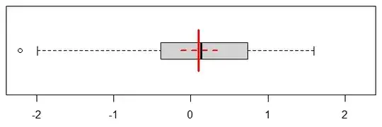
Here is a boxplot of the exact same data, and I'll add the mean and CI:
Now we can read the quartiles off the picture immediately. This does a much better job at communicating the true spread of the underlying observations. And nothing keeps us from overlaying the mean and its CI, as we did here. And as you note, we can use notches to indicate the CI of the median.
If we have a smallish sample - like with our $n=50$, we can even add the original observations, with a little vertical jitter (and if we have a larger number of observations, we can plot a subsample):
Finally, my personal favorite is the beanplot (also known as a violinplot), which is essentially a kernel density estimate. As before, we can add the mean and CI, and also overlay a boxplot, and the original data:
R code:
set.seed(1)
observations <- rnorm(50)
estimate <- t.test(observations)

windows(6,2); par(mai=c(.5,.1,.1,.1))
plot(c(-1,1)*max(abs(observations)),c(0,2),yaxt="n",xlab="",ylab="",type="n")
lines(rep(estimate$estimate,2),c(0.5,1.5),lwd=3,col="red")
lines(estimate$conf.int,rep(1,2),lwd=2,col="red",lty=2)
dev.off()

windows(6,2); par(mai=c(.5,.1,.1,.1))
boxplot(observations,horizontal=TRUE,main="",yaxt="n",
    xlim=c(0,2),ylim=c(-1,1)*max(abs(observations)))
lines(rep(estimate$estimate,2),c(0.5,1.5),lwd=3,col="red")
lines(estimate$conf.int,rep(1,2),lwd=2,col="red",lty=2)
dev.off()

windows(6,2); par(mai=c(.5,.1,.1,.1))
boxplot(observations,horizontal=TRUE,main="",yaxt="n",
    xlim=c(0,2),ylim=c(-1,1)*max(abs(observations)),outline=FALSE)
set.seed(1)
points(observations,runif(length(observations),0.7,1.3),pch=19,cex=0.6)
lines(rep(estimate$estimate,2),c(0.5,1.5),lwd=3,col="red")
lines(estimate$conf.int,rep(1,2),lwd=2,col="red",lty=2)
dev.off()

library(beanplot)
windows(6,2); par(mai=c(.5,.1,.1,.1))
beanplot(observations,what=c(0,1,0,0),horizontal=TRUE,main="",yaxt="n",
    xlim=c(0,2),ylim=c(-1,1)*max(abs(observations)),col="lightgray",border=NA)
boxplot(observations,horizontal=TRUE,add=TRUE,outline=FALSE)
set.seed(1)
points(observations,runif(length(observations),0.7,1.3),pch=19,cex=0.6)
lines(rep(estimate$estimate,2),c(0.5,1.5),lwd=3,col="red")
lines(estimate$conf.int,rep(1,2),lwd=2,col="red",lty=2)
dev.off()
- 95,027
- 13
- 197
- 357


