0

I have a practical question. I am trying to select the number of clusters in k-means clustering and I have tried a Silhouette analysis, an elbow plot looking at the residuals, and a hierarchical clustering. However I still cannot decide how many clusters to pick since it is not that straightforward in my case. For my research (to avoid Reviewer 2 angry) I should be able to justify the number of k clusters. Based on these plots, I would really appreciate if anyone could give me some insight.

EDIT

My data is 2-dimensional, I have irregulary-unevenly spaced measurements of glucose in blood, for many patients. Then, I want to find if there are groups of patients whose progression of glucose looks differently. The objective is to understand the characteristics of each group in order to (hopefully) find interesting associations e.g. patients with kidney failure tend to have higher glucose levels sooner. For this purpose I use an EM algorithm which uses thin-plate splines and k-means. I am using a very similar approach to this one: https://cran.r-project.org/web/packages/clustra/vignettes/clustra_vignette.html
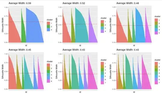
Silhouette Analysis Elbow plot Hierarchical clustering

adrian1121
  • 856
  • 8
  • 22
  • 1
    What are you using this cluster analysis for? Surely, that must play an (important) role in deciding how many clusters to retain! – whuber Jan 17 '22 at 17:06
  • 2
    https://stats.stackexchange.com/questions/554363/can-not-define-the-right-number-of-cluster-on-k-means/554372#554372 – Christian Hennig Jan 17 '22 at 17:32
  • 2
    Regarding hierarchical clustering, what corresponds to k-means (using the same objective function) is actually Ward's method, not complete linkage, which apparently is what your plot shows. Anyway, a dendrogram of a hierarchical method can only indicate the number of clusters for itself (if anything - even this is questionable), not for any other method. – Christian Hennig Jan 17 '22 at 17:34
  • 1
    It is in most cases at least as instructive to look at plots that show your data more directly, with clusterings indicated, e.g., by colours, as looking at plots that show the output of methods such as the silhouette or a dendrogram. Of course how far you get using simple scatterplots (or maybe principal components) depends on your data, particularly the number of variables, assuming they are all Euclidean (real numbers). – Christian Hennig Jan 17 '22 at 17:38
  • Thanks for your comments. I added a bit of detail of what I am doing. – adrian1121 Jan 17 '22 at 18:14
  • 1
    Re the edit: how will you use the results of the analysis? Would you treat those patients differently according to the group you place them in? If so, there could be adverse consequences for placing them in many groups, as well as benefits, so an analysis of that might guide you. Alternatively, if the outcome wouldn't really make a material difference in how patients are treated, maybe the answer doesn't much matter and you might want to choose a number of clusters that makes your life simpler. Notice how this requires consideration of information not yet in evidence. – whuber Jan 17 '22 at 18:18
  • 1
    Your edit still doesn't still give me a clear idea what your data are. Are all measurements of the same kind and different variables correspond to different time points? I suspect that methods specifically for time series clustering are more suitable for this. k-means doesn't take into account potential dependence between variables, which you for sure will have with time series data. – Christian Hennig Jan 17 '22 at 18:18
  • 2
    I would still follow @ChristianHennig's advice and plot the model's predicted glucose levels over time for the different clusters in different colors & see if it's sensible & actionable. If you don't know, show the different plots (1 for each potential clustering) to a doctor that treats such patients & ask them which looks meaningful. If no one knows, you probably don't have something you should try to publish. – gung - Reinstate Monica Jan 17 '22 at 18:23
  • Thanks for the comments, I added a bit more context on the problem and a plot showing how the centroids of the splines look like. As you can see the gain is marginal but it is also meaningful. That said, from a medical perspective k=4 or k=5 does not change much the story. Given this circumstances, choosing 4 or 5 comes to an arbitrary decision, hence my question... – adrian1121 Jan 17 '22 at 18:35
  • @adrian1121 It'd help if you look at a plot of all curves (assuming that there are not that many from your hierarchical plot), as the plots of mean curves only don't allow to assess how well the mean curves represent the whole data set. It may be the overall model can be written down as a mixture model, in which case you could use BIC or ICL for deciding about the number of clusters. – Christian Hennig Jan 17 '22 at 22:05

0 Answers0