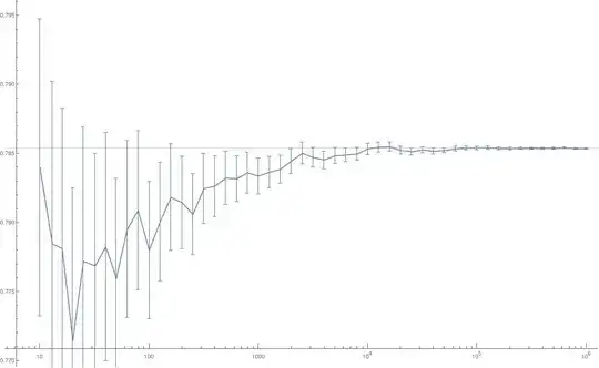
Here's some data$^1$ denoting the variation of the mean of samples (y-axis) with the no. of samples (x-axis). The uncertainties are $1\sigma$ standard deviation of those samples.
Clearly the data has a trend. It converges to some value and has less uncertainty with more samples.
However, the data isn't smooth $^2$ and is made up of a jagged line of dips and bumps.
- How does one quantitatively differentiate if these peaks and valleys are actual features of data or just random fluctuations?$^3$
For e.g. here is one way to justify that most features are just stochastic noise.
i. Calculate a data trend (here a MeanFilter of kernel radius $\in{1,3,11}$ was used)
ii. Check if any $1\sigma$ data pts. are entirely out of your $1\sigma$ trendline. If they are, then upto $1\sigma$ they are actual features
Here's it in action:
 Fig2. Graph of data and a trendline with a MeanFilter of radius $3$.
 Fig3. Graph of data and trendlines with more drastic MeanFilter radii
- Is this heuretic a valid way of categorising bumps as actual features or noise?
Footnotes
$^1$ This was a Monte Carlo simulation to calculate the value of $\pi/4$. $100$ points were uniform randomly selected from a square circumscribing a unit circle and the ratio of the points that lay within the circle to all the points calculated. This formed one sample. The x-axis on the graph displays the no. of samples while the y-axis shows the arithmetic average of those samples. The uncertainties are $1\sigma$ standard deviation of those samples.
$^2$ and stays fluctuant even if the x-axis was more finely sampled.
$^3$ In this case I expect them being genuine statistical noise.
