this may be a beginner’s question, but any help is appreciated! First, how to interpret the interaction between continuous variables? Such as WORD_LENGTH_SCALE:Freq_SCALE and WORD_LENGTH_SCALE:Freq_SCALE:Freq_2nd?
Here are my codes (Freq_2nd is not applicable to a word length condition. That is, when the word length = 1, Freq_2nd is NA. Thus, i wrote is as (WORD_LENGTH_SCALE:Freq_2nd)):
fm = lmer (response  ~ WORD_LENGTH_SCALE * Freq_SCALE *
    (WORD_LENGTH_SCALE:Freq_2nd) + (1| subjects) + ( 1 | trail_no),
    data = data_01, REML = TRUE)
and the results:
 Fixed effects:
                                       Estimate Std. Error t value
(Intercept)                            4.205600   0.015334 274.272
WORD_LENGTH_SCALE                     -0.025104   0.015568  -1.613
Freq_SCALE                            -0.004509   0.001953  -2.309
WORD_LENGTH_SCALE:Freq_SCALE          -0.019313   0.008061  -2.396
WORD_LENGTH_SCALE:Freq_2nd             0.004601   0.002513   1.831
WORD_LENGTH_SCALE:Freq_SCALE:Freq_2nd  0.003309   0.001370   2.416

Correlation of Fixed Effects:
                           (Intr) WORD_LENGTH_SCALE F_SCAL WORD_LENGTH_SCALE:Fr_SCALE WORD_LENGTH_SCALE:F_2
WORD_LENGTH_SCALE          -0.029
Freq_SCALE                  0.145  0.093
WORD_LENGTH_SCALE:Fr_SCALE -0.015  0.849             0.051
WORD_LENGTH_SCALE:F_2      -0.024 -0.958            -0.295 -0.825
WORD_LENGTH_SCALE:F_SCALE: -0.033 -0.785            -0.284 -0.957                      0.839
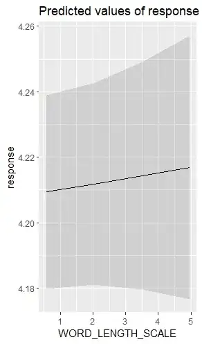
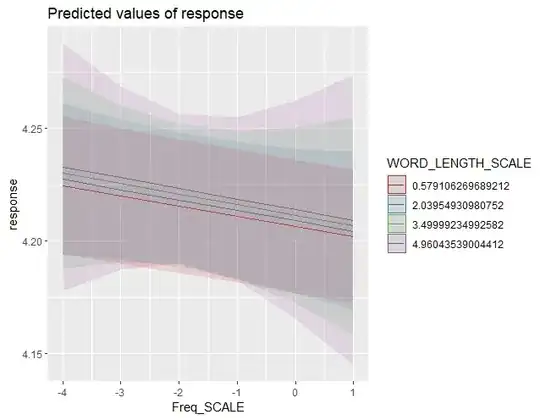
Second, I used the ggeffects, sjPlot and prediction function to plot graphs, but they seem different from the model. In the model, the Freq_SCALE and WORD_LENGTH_SCALE are negative, while in the plot, the Freq_SCALE is negative but the WORD_LENGTH_SCALE is positive. Why is this the case?
Third, what is the most reliable way to visualize the mixed model? sjPlot and the prediction function give me different plots. So I am not sure what to do ...
sjPlot
prediction:


