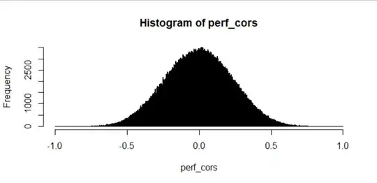
I'm trying to figure out what this distribution is so that I can calculate the exact probability of values close to 1 or -1 using its PDF:
as produced by the following code in R:
random_length <- 20
random_vars <- matrix(runif(1000*random_length),
                      nrow = random_length)
perf_cors <- cor(random_vars)
perf_cors <- perf_cors[!perf_cors==1] # Remove self-correlations
hist(perf_cors, breaks = seq(-1, 1, length.out=1000))
My original problem was to figure out the probability of getting a correlation above 0.95 just by chance for a sequence of 20 known values, which I approached by simulation here and can estimate as "very small". However, I'd like to expand this to longer/shorter lengths of random variables and correlation cutoffs higher/lower than 0.95, which means that I can't simulate everything and instead need the PDF of this distribution as a function of random variable vector length. The self-correlation matrix I use below is just a way to get a lot of "random" correlation values very quickly. Here's a couple more histograms with varying random variable vector lengths:
as produced with the following R code:
par(mfrow=c(2, 2))
sapply(c(5, 10, 20, 50), function(random_length){
  random_vars <- matrix(runif(1000*random_length),
                        nrow = random_length)
  perf_cors <- cor(random_vars)
  perf_cors <- perf_cors[!perf_cors==1] # Remove self-correlations
  hist(perf_cors, breaks = seq(-1, 1, length.out=1000),
       main = paste("Random length =", random_length))
})
layout(1)
I've gotten close to estimating one using the beta distribution - the shape looked like a nice bell curve but the probability is zero for exactly 0 and 1 which made me think beta. Fiddling with the shape parameters (settling on alpha and beta as 10) gave me a pretty nice fit but I've only done this when the random variable vector length is 20 and the fit still isn't perfect.
created with the R code:
random_length <- 20
random_vars <- matrix(runif(1000*random_length),
                      nrow = random_length)
perf_cors <- cor(random_vars)
brks <- seq(-1, 1, length.out=1000)
cors_cut <- cut(perf_cors, breaks = brks)
cors_table <- table(cors_cut)
plot(head(brks, -1), cors_table/max(cors_table), yaxt="n",
                     xlab = "", ylab="")
perf_curve <- dbeta(seq(0, 1, length.out=1000), shape1=5, shape2=5)^2
perf_curve <- dbeta(seq(0, 1, length.out=1000), shape1=10, shape2=10)
lines(brks, perf_curve/max(perf_curve), col="red", lwd=2)
I've already searched a bit on the site for similar questions, and found this one that doesn't provide a PDF and this one that went straight over my head.
Any advice for what distribution I'm looking at here?


