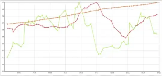
Objective: Get the red line to go as high as possible.
I can control the values of the green and orange lines. There are like 50 other lines that I control and can pit against the red line as well.
What is a good way to determine which lines are correlated with movement in the red line?
For example:
- Which lines tend to go up when the red line goes up?
- Which lines tend to go down when the red line goes up?
- Which lines seem to have an "optimal value" for the red line (anything higher or lower is correlated with the red line being not as high)
Is there some kind of mathematical analysis that can be run against the series to get answers to these questions?
For any programmers, am using JavaScript and Python, so any libraries in those languages would be helpful as well.
More background info
This question applies to a horizontally scaled super computing system. The red line is how much the system is getting done per minute.
The green line is the database response time for a certain operation. So if the database response time that the green line represents is low when the red line is high and high when the red line is low, then I know that I need to look in to optimizing the response time of that database.
The orange line represents how many threads are running in the system. Obviously, too few threads mean less will get done, but I also suspect that too many threads may bog the system down as well, so it would be cool to be able to know if there is an "optimal" value for the number of threads running in the system.
Thanks so much!