1

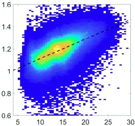
I've been looking into how to fit a line to a 2D histogram and have come across different pieces of information which I can't quite piece together. To show what I mean, I want to achieve something like the image below which is taken from a paper:

exmaple

In the paper they refer to the line simply as the "linear regression result" but it is evidently not a regular linear regression as we are not dealing with just points in a plane as usual. They do not give further details on this that I could catch. I've seen plots like this in other places too even with confidence intervals for the regression line.

Looking around elsewhere I found this question in stack overflow. They advise OP to use the first principal component for the line which makes sense but this should be possible with regression as that is what they use in the paper. In the comments there is also some talk about "weighted least squares" which is a variant of ordinary least sqaures that is useful when the residuals show heteroscedasticity. However, I do not understand why this regression would be relevant to the problem or if thats what they are doing in the paper.
MikeKatz45
  • 245
  • 1
  • 8
  • 1
    Why do you say that it’s not a regular linear regression line? To me, it looks about like how I would expect the OLS line to look. – Dave Nov 25 '21 at 07:24
  • 1
    But these *are* (obviously) points in the plane! Yes, they are binned, but the bin size is so small compared to the ranges of the data that this makes essentially no difference. That makes this a perfectly standard textbook least squares regression. If one has only the bin counts (not the raw data) it can be computed using weighted least squares formulas. It's good to question whether regression is relevant to the problem--but we can't advise you about that, since you haven't explained what the problem is. – whuber Nov 25 '21 at 16:33

2 Answers2

2

The paper doesn’t seem to say that the regression line is estimated from the histogram. The usual approach, that they likely took, is to calculate regression on the same raw data that was used for generating histogram and show them both on same plot.

Tim
  • 108,699
  • 20
  • 212
  • 390
  • Ok... Maybe I'll try a small practical example doing that because for some reason I initially thought that the position of the line calculated with the raw points would make no sense in the histogram space, but now that you mention it... Thanks for the insight – MikeKatz45 Nov 25 '21 at 07:35
  • @MikeKatz45 histogram approximates the distribution, regression line the conditional mean, why “wouldn’t they make sense together”? – Tim Nov 25 '21 at 07:57
0

For future reference, if anyone struggles (like I did) to see that you can map the regression line from the raw data directly into your histogram plot, here is a small example in R. Props to Tim and the commenters for the insight:

# simulate the raw data
set.seed(123)
nsim <- 1000
noise <- 0.5
p <- rnorm(nsim)
x <- p + rnorm(nsim, sd = noise)
y <- p + rnorm(nsim, sd = noise)

# define the breaks
binSize <- 1
xbrks <- seq(floor(min(x)), ceiling(max(x)), binSize)
ybrks <- seq(floor(min(y)), ceiling(max(y)), binSize)

# calculate 2D histogram and plot
H <- table(findInterval(x, xbrks), findInterval(y, ybrks))
image(xbrks, ybrks, H, col = rev(topo.colors(max(H))))
abline(lm(x ~ y, cbind.data.frame(x = x, y = y)))

solve1

The regression is based on the original unbinned data:

points(x, y, col = 2)

solve2

MikeKatz45
  • 245
  • 1
  • 8
  • Although generating random points to reproduce the data approximately will work, it is incredibly inefficient: when there are enough data to generate a detailed heat map, you typically will be working with millions (or far more) artificial points. Use weighted regression instead. The computational complexity then depends only on the number of nonzero cells in the raster. – whuber Nov 26 '21 at 15:50
  • 1
    FWIW, here is an `R` solution based on the heatmap alone. It uses the midpoints of the cells for the $(x,y)$ coordinates (first two lines), finds the OLS regression (third line), and plots it (fourth line). `x – whuber Nov 28 '21 at 15:28