I was looking at some newly gathered data comprised of reading times measured in ms and I decided to plot the observed values prior to cleaning the data to see to what extent the data is normally distributed. I was quite surprised to see this pattern. While I somehow understand from this that the data is right skewed, I do not really understand why the line is flat. I have searched for explanaitions in stats books and on the internet, but no examples that I have found resemble the pattern that I observed.
-
2The help page for `qqline` states: "`qqline` adds a line to a “theoretical”, by default normal, quantile-quantile plot which passes through the probs quantiles, by default the first and third quartiles." Does this answer your question? – COOLSerdash Jul 23 '21 at 12:01
-
1If your data had been sampled from a normal distribution, you would have expected the qqplot to be close to a straight line. Try something like `qqnorm(rnorm(1000,mean=100,sd=10))` to see an example. Your chart shows severe right skewness (and possibly infinite population variance). Something like `qqnorm(200*abs(rt(1000,2)))` might be similar – Henry Jul 23 '21 at 12:03
-
Thank you so much for your answers. It is clear to me that the data I am looking at is not normally distributed. But is there anything else that the flatness can inform about? Any other characteristic of the data? I can also see that there are lots of outliers, but I wonder whether there would be more ways to describe the plot other than non-normal distribution, presence of outliers and right-skewness due to the slight upward curve? Thanks! – amp Jul 23 '21 at 12:08
-
3"*I do not really understand why the line is flat.*" I don't see any flat line - the qqline is upward sloping as we would expect, and the data plot shows an extremely right-skew distribution – Robert Long Jul 23 '21 at 12:09
-
@RobertLong thank you so much for your comment. Flat is indeed not the right way to describe this line. I have only described it as such because it looked flatter in comparison to the examples that I have seen so far and it was not so clear to me why it is so close to the x-axis. – amp Jul 23 '21 at 12:13
-
3I think what you call "flat" comes from the fact that a very large sample quantile makes it necessary for the y-axis to have a very large value range, so that the slope of the "theoretical" line looks very low. – Christian Hennig Jul 23 '21 at 12:55
-
2This https://stats.stackexchange.com/questions/101274/how-to-interpret-a-qq-plot is the guide to interpret a qqplot! – kjetil b halvorsen Jul 23 '21 at 13:52
-
1This plot is the opposite of flat: it is *incredibly steep.* If you were to recreate it with a 1:1 aspect ratio, the middle part would have a slope between 100 and 1000 and look vertical on the screen. You might--and ought--to object that the aspect ratio is not inherently determined because the two axes are expressed in different units of measurement. But that's exactly the point: in such cases, the *perception* of "flatness" depends entirely on the scales you choose for the axes. Flatness becomes a visual artifact: watch out that it doesn't fool you! – whuber Jul 23 '21 at 19:47
1 Answers
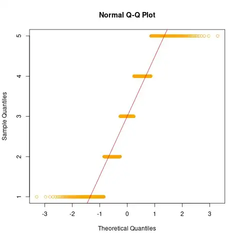
One way to understand qqplots is to simulate data with particular properties and look at the qqplots they produce. Below is a simulation that produces some flat lines in the qqplot:
In each of the horizontal lines, the theoretical quantile is varying, while the sample quantile is constant. The only way the sample quatile can be constant, is that the sample value is constant. And indeed, the R code for the simulation was
sample(1:5, 1000, replace=TRUE)
which samples, with equal probability, each of the values 1,2,3,4 or 5.
In your case, the left part of the plot is only almost flat, meaning that the data values varies slowly, over a small range, while in the right part of the plot they are varying more rapidly, over a large range, indicating an asymmetric, right-tailed distribution. So simulate data from distributions like gamma, Weibull or the lognormal and look at their qqplots!
- 63,378
- 26
- 142
- 467

