11

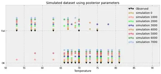
For a Bayesian logistic regression problem, I have created a posterior predictive distribution. I sample from the predictive distribution and receive thousands of samples of (0,1) for each observation I have. Visualizing the goodness-of-fit is less than interesting, for example:

enter image description here

This plot shows the 10 000 samples + the observed datum point (way in the left one can make out a red line: yea that's the observation). The problem is is that this plot is hardly informative, and I'll have 23 of them, one for each data point.

Is there a better way to visualize the 23 data points plus there posterior samples.
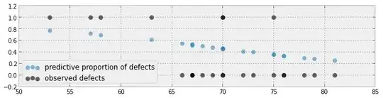

Another attempt:

enter image description here


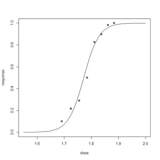
Another attempt based on the paper here

enter image description here

Cam.Davidson.Pilon
  • 11,476
  • 5
  • 47
  • 75
  • 1
    See [here](http://pymc-devs.github.com/pymc/modelchecking.html#goodness-of-fit) for an example where the above data-vis technique works. – Cam.Davidson.Pilon Mar 23 '13 at 14:52
  • That is alot of wasted space IMO! Do you really only have 3 values (below 0.5, above 0.5, and the observation) or is that just an artifact of the example you gave? – Andy W Mar 25 '13 at 12:33
  • It's in fact worse: I have 8500 0s and 1500 1s. The graph just pushes these values to make a connected histogram. But I agree: lots of wasted space. Really, for each data point I can reduce it to a proportion (ex 8500/10000 ) and a observation (either 0 or 1) – Cam.Davidson.Pilon Mar 25 '13 at 13:10
  • So you have 23 data points, and how many predictors? And is your posterior predictive distrubtion for new data points or for the 23 you used to fit the model? – probabilityislogic Mar 31 '13 at 05:09
  • Your updated plot is close to what I was going to suggest. What is the x-axis representing though? It appears you have some points super-imposed - which with only 23 seems unnecessary. – Andy W Mar 31 '13 at 13:57
  • @AndyW the x-axis is temperature, and like you guessed, the same temperature was recorded for possibly more than 1 observation. – Cam.Davidson.Pilon Mar 31 '13 at 14:58
  • @probabilityislogic The only predictor is temperature, shown on the x-axis above (second plot). The posterior predictive distribution is currently for the observed data points, though it is possible to sample it for arbitrary temperature. – Cam.Davidson.Pilon Mar 31 '13 at 15:00
  • Thanks @Cam.Davidson.Pilon I came here following the link on your book. One question I have is, why is there no mention of the [**marginal likelihood**](http://en.wikipedia.org/wiki/Marginal_likelihood) (model evidence) $p(D|m)$ when discussing if the model is a good fit? Wouldn't also that help with the visualization? (in particular in the comparison between possible models for predicting defects that you have in the book). – Amelio Vazquez-Reina Mar 16 '14 at 20:59
  • @user023472 Yes, that is good suggestion. Marginal likelihoods, and specifically Bayes factor, are both good tools of goodness-of-fit. For V2.0 perhaps =) – Cam.Davidson.Pilon Mar 17 '14 at 00:33

3 Answers3

5

I have a feeling your not quite giving up all the goods to your situation, but given what we have in front of us lets consider the utility of a simple dot-plot to display the information.

Dot Plot

The only real thing to not here (that aren't perhaps default behaviors) are:

  • I utilized redundant encodings, shape and color, to discriminate between the observed values of no defects and defects. With such simple information, placing a dot on the graph is not necessary. Also you have a problem when the point is near the middle values, it takes more look-up to see if the observed value is either zero or one.
  • I sorted the graphic according to observed proportion.

Sorting is the real kicker for dot-plots like these. Sorting by values of proportion here helps easily uncover high residual observations. Having a system where you can easily sort by values either contained in the plot or in external characteristics of the cases is the best way to get the bang for your buck.

This advice extends to continuous observations as well. You could color/shape the points according to whether the residual is negative or positive, and then size the point according to the absolute (or squared) residual. This is IMO not necessary here though because of the simplicity of the observed values.

Andy W
  • 15,245
  • 8
  • 69
  • 191
  • 1
    I do like this solution and content, I'm just waiting on other submissions. Thanks Andy. – Cam.Davidson.Pilon Apr 01 '13 at 18:17
  • 1
    @Cam.Davidson.Pilon - I'm waiting on other submissions too! Because your model only has one predictor - sorting by the predicted proportion of defects would be synonymous as sorting by temperature (assuming a monotonic effect - as it appears in your graph). Perhaps someone will come along though with another solution that effectively allows one to see both the predicted proportion and original temperature (or something completely different). This display is good for seeing bad predictions, but is not very good for things like seeing non-linear effects. – Andy W Apr 01 '13 at 18:42
  • 1
    I'm happy to award the bounty to you. Sorting is the key to presenting it, and the paper linked from your previous post is what I'll be using. Thanks! – Cam.Davidson.Pilon Apr 05 '13 at 03:55
4

The usual way to visualising the fit of a Bayesian logistic regression model with one predictor is to plot the predictive distribution together with the corresponding proportions. (Please, let me know if I understood your question)

An example using the popular Bliss' data set.

enter image description here

Code Below in R:

library(mcmc)

# Beetle data

ni = c(59, 60, 62, 56, 63, 59, 62, 60) # Number of individuals
no = c(6, 13, 18, 28, 52, 53, 61, 60) # Observed successes
dose = c(1.6907, 1.7242, 1.7552, 1.7842, 1.8113, 1.8369, 1.8610, 1.8839) # dose

dat = cbind(dose,ni,no)

ns = length(dat[,1])

# Log-posterior using a uniform prior on the parameters

logpost = function(par){
var = dat[,3]*log(plogis(par[1]+par[2]*dat[,1])) + (dat[,2]-dat[,3])*log(1-plogis(par[1]+par[2]*dat[,1]))

if( par[1]>-100000 ) return( sum(var) )
else return(-Inf)
}

# Metropolis-Hastings
N = 60000

samp <- metrop(logpost, scale = .35, initial = c(-60,33), nbatch = N)

samp$accept

burnin = 10000
thinning = 50

ind = seq(burnin,N,thinning)

mu1p =   samp$batch[ , 1][ind]

mu2p =   samp$batch[ , 2][ind]


# Visual tool

points = no/ni
# Predictive dose-response curve
DRL <- function(d) return(mean(plogis(mu1p+mu2p*d)))
DRLV = Vectorize(DRL)

v <- seq(1.55,2,length.out=55)
FL = DRLV(v)

plot(v,FL,type="l",xlab="dose",ylab="response")
points(dose,points,lwd=2)
Andy W
  • 15,245
  • 8
  • 69
  • 191
Cerberis
  • 41
  • 2
  • I'm not an R guy, can you provide the plot/output? – Cam.Davidson.Pilon Apr 02 '13 at 11:32
  • @Cam.Davidson.Pilon I am sorry, my reputation does not allow me to include plots. But the idea is to plot the whole dose-response curve together with the observed proportions. – Cerberis Apr 02 '13 at 11:40
  • I've added the picture. You assume a different structure for the data in which the OP's does not directly extend to your example. The OP's data would be like if your `ni = 23` and `no = 7` and each of the 23 individuals has a different `dose`. You could make a similar plot for the OP's data though, (points are either placed at 0 or 1 on the Y axis, and you plot the function). See some examples of similar plots for logistic regression in the references [I give on this answer](http://stats.stackexchange.com/a/45099/1036). – Andy W Apr 02 '13 at 12:24
  • @AndyW Thanks for this and for the clarification as well. – Cerberis Apr 02 '13 at 12:29
  • @AndyW ah the papers you link are quite useful! I'll have to take a closer look at those to see if I can apply them. – Cam.Davidson.Pilon Apr 02 '13 at 14:14
4

I am responding to a request for alternative graphical techniques that show how well simulated failure events match observed failure events. The question arose in "Probabilistic Programming and Bayesian Methods for Hackers " found here. Here's my graphical approach:

Simulated vs Observed O-Ring Failures

Code found here.

user35216
  • 141
  • 2
  • Interesting -- can you offer any arguments on why to use this technique? Thanks for sharing! – Cam.Davidson.Pilon Nov 23 '13 at 18:08
  • This is a probabilistic, not a deterministic result. Therefore, I looked for a representation that conveyed several things: 1) the range of observed and predicted events; 2: the probability distribution of the predicted failures; 3) the probability distribution of predicted non-failures; and 4) ranges where failure is more likely, non-failure is more likely, and ranges where failure and non-failure likelihoods overlap. This graph shows does all that to my eyes. – user35216 Dec 03 '13 at 20:35
  • A few more additions/clarifications: 1) the **temperature** range of observed and predicted events; 5) actual observed failures and non-failures – user35216 Dec 03 '13 at 20:48