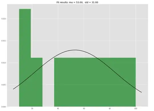
In trying to understand the y values of a normal distribution plot I use this code:
%reset -f

import numpy as np
from scipy.stats import norm
import matplotlib.pyplot as plt

data = [10,10,20,40,50,60,70,80,90,100]

# Fit a normal distribution to the data:
mu, std = norm.fit(data)

# Plot the histogram.
plt.hist(data, bins=10, density=True, alpha=0.6, color='g')

# Plot the PDF.
xmin, xmax = plt.xlim()
x = np.linspace(xmin, xmax, 100)
p = norm.pdf(x, mu, std)
plt.plot(x, p, 'k', linewidth=2)
title = "Fit results: mu = %.2f,  std = %.2f" % (mu, std)
plt.title(title)

plt.show()
to generate this plot:
The data is the age in years of people in a group: [10,10,20,40,50,60,70,80,90,100]
How to interpret the y values of the generated pdf plot? For instance, how should the bar with play approx equal to 0.027 be interpreted?
I've read various posts such as :
But can't find information that details an interpretation of the y axis values of the plot.
Is 0.027 the probability the age is in the range from 0 to approx 20 ?
