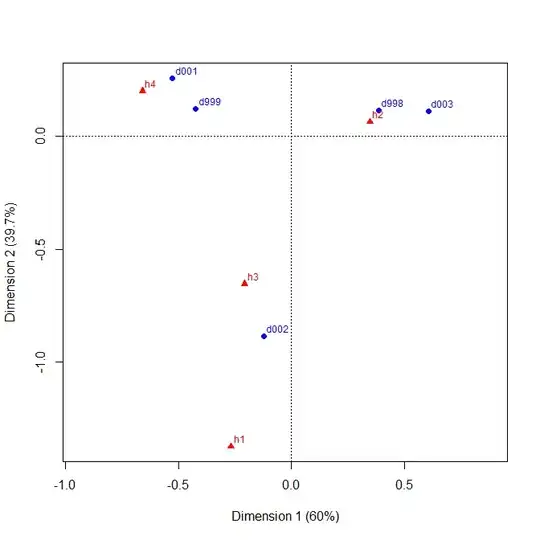
Assume a data table that presents the p-values of a large number of independent runs of a statistical hypothesis test. Each run represents a single test with two possible hypotheses (i.e., null and alternative) on a particular dataset (or treatment or whatever you want to call it). A total of d different datasets (represented in the table as rows) and h different hypotheses (represented as columns) were evaluated to generate the table. The data table, thus, portrays the p-values of d x h different runs.
     |   h1    h2    h3    h4
----------------------------
d001 | 0.02* 0.33  0.01* 0.46
d002 | 0.14  0.25  0.03* 0.11
d003 | 0.01* 0.68  0.01* 0.04*
...
d998 | 0.02* 0.71  0.01* 0.13
d999 | 0.03* 0.29  0.02* 0.33
Since the number of datasets evaluated ranges in the hundreds, I would like to find a way to visualize shared instances of significance graphically. Specifically, I would like to highlight if any of the hypotheses (i.e., columns) share instances of p-values<alpha with other such hypotheses for the same datasets (i.e., rows). In the above example, hypotheses h1 and h3 share instances of p-values<alpha across numerous datasets.
What general type of visualization would you recommend? (I'll set up the R code myself and am just interested in the type of visualization that you would recommend.)

