In this article by David Hand an implicit function of the classification cost ratio is calculated for a specific dataset, resulting in a discrete distribution:
This is defined as
$$ w_G(c) = \pi_0 f_0(P_1^{-1}(c))\left\vert \frac{dP_1^{-1}(c)}{dc}\right\vert + \pi_1 f_1(P_1^{-1}(c))\left\vert \frac{dP_1^{-1}(c)}{dc}\right\vert$$
with
$$c= \Pr(1\vert T)= P_1(T)= \pi_1 f_1(T) / \left\{ \pi_0f_0(T) + \pi_1f_1(T)\right\}$$
and $$T(c_0,c_1)=\underset{t}{\text{arg min}}\left\{ c\pi_0(1-F_0(t)) + (1-c) \pi_1 F_1(t) \right\}$$
with $t$ being any threshold score, $T$ the threshold that minimizes the cost ratio $c=\frac{c_0}{c_0+c_1}$, and $f_0,f_1$ the pdf's of score values for normal and disease groups (with corresponding cdf's $F_0,F_1$), and $\pi_0, \pi_1$ the proportion of normal and diseased.
Can someone give me some mathematical equation, algorithm or pseudocode sketch as to how the peaks in the plot are generated?
To illustrate with an example from this related question:
install.packages('pROC')
install.packages('ROCR')
install.packages('Epi')
install.packages('hmeasure')
library(pROC)
library(ROCR)
library(Epi)

set.seed(561)

cost0 = 1   # Cost of mis-classifying a normal as having cancer in million $
cost1 = 10   # Cost of mis-classifying a cancer patient as normal (death?)

b = cost0 + cost1
c = cost0/(b)

n = 7000    # Total cases
pi0 =.8     # Percentage of normal
pi1 =.2     # Percentage of disease

# Actual values of the test for normals and disease (D higher test values)
testA_Normals = rnorm(n*pi0, mean=3, sd=1)
testA_Sick = rnorm(n*pi1, 6, 1)

# Determining a threshold based on cost
# arg t min {Loss = cost0 * (1 - pnorm(t,3,1)) * pi0 +
#            cost1 * pnorm(t,6,1) * pi1}

t = seq(0,10,0.0001)
loss <- cost0 * (1 - pnorm(t,3,1)) * pi0 + cost1 * pnorm(t,6,1) * pi1
Threshold = data.frame(t,loss)[which(loss==min(loss)),]$t

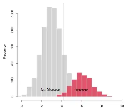
hist(testA_Normals,border=F, xlim=c(0,10))
hist(testA_Sick,col=2,border=F, add=T)

abline(v=Threshold)
hmeas = HMeasure(data$outcome, data$testA)
par(mfrow=c(2,2))
plotROC(hmeas,which=1)
plotROC(hmeas,which=2)
plotROC(hmeas,which=3)
plotROC(hmeas,which=4)


