0

I am using below two codes for plotting the autocorreleation of a time series,

The data looks like below:

head(hr_mymts)

Time Series:
Start = c(1, 1) 
End = c(1, 6) 
Frequency = 168 
     TempCurr
[1,] 173.2593
[2,] 176.8880
[3,] 175.6530
[4,] 174.2694
[5,] 174.1474
[6,] 173.3630
attr(,"index")
  [1] 1597042800 1597046400 1597050000 1597053600 1597057200 1597060800
attr(,"index")attr(,"tzone")
[1] 
attr(,"index")attr(,"tclass")
[1] POSIXct  POSIXt
ggAcf(
  hr_mymts,
  lag.max = 940,
  type = c("correlation"),  plot = TRUE,
)

ggacfplot

and ,

plot(acf(hr_mymts,lag.max = 940,plot = FALSE),main=NA)

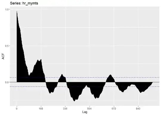
acfplot Both results should be the same, but I can see the x-axis of the lag is different. Is there any way to get similar results? I want ggplot of ACF should have lags 1,2,3,.... on x-axis. I didn't understand the difference between the two ACF plots.
NewLearner
  • 23
  • 4

1 Answers1

1

It would depend upon how your data series was organized. Using the canonical AirPassengers dataset, which is a time series by month, the acf() function produces a plot with the axis in yearly units. Below is a quick demonstration of how the plot defaults to labeling from 0 to 1. On the other hand, ggAcf() labels the lags from 0 to 12. In general, your two plots agree, but you need to rescale your x-axis. It appears you're partial to the default scaling produced by the acf() function. I tried to reverse engineer how acf() is denominating your intervals, but I have no idea if you're working in minutes or hours.

If you want to work with ggplot(), then I recommend modifying the plot to your precise specification. To do this, try extracting the elements you need then execute the plot manually. Once you reproduce the figure, which I recommend doing using geom_segment(), try rescaling the axes to suit your needs.

acf()

acf(AirPassengers, lag.max = 12)

acf_plot

ggAcf()

ggAcf(AirPassengers, lag.max = 12)

ggAcf_plot

Reproducing it manually using ggplot()

pull <- ggAcf(AirPassengers, lag.max = 12, plot = FALSE)
df <- with(pull, data.frame(lag, acf))

ggplot(data = df, mapping = aes(x = lag, y = acf)) + 

# draw the lines

  geom_hline(aes(yintercept = ci_line), linetype = "dashed", color = "darkblue") +
  geom_hline(aes(yintercept = 0)) +
  geom_hline(aes(yintercept = -ci_line), linetype = "dashed", color = "darkblue")

# add the appropriate layer and rescale

  geom_segment(mapping = aes(xend = lag, yend = 0)) +
  scale_
Thomas Bilach
  • 4,732
  • 2
  • 6
  • 25
  • Hi, @Thomas Bilach Thank you for the very first answer. I am new here and in time series. I didn't get the answer really! Can you explain how can I add a subset of my data? The data is in hourly intervals. How can I found (yintercept = ci_line) ? Will appreciate your help. – NewLearner Dec 23 '20 at 13:38
  • 1
    Refer to this [post](https://meta.stackexchange.com/questions/176460/how-to-paste-data-from-r-to-stackoverflow). The code I provided was to help you amend the plot to your liking. The object `ci_line` or `-ci_line` is to get the plot looking like the default `acf()` plot. It isn’t necessary but it will look nicer if you add it. – Thomas Bilach Dec 23 '20 at 18:26
  • Hi @Thomas Bilach, Thanks a lot. I am able to do that now with ggacf. Wil it be possible to check and answer my other question if you have any idea ? – NewLearner Dec 23 '20 at 21:49
  • 1
    @NewLearner Great! If my answer helped please give it a check. I will take a look at your other post. And in the future, posting a subset of your data or a full summary of your output increases your chances of getting a response. – Thomas Bilach Dec 23 '20 at 22:40