2

How can I group the world's 200-odd countries into (say) ten groups, with each group's countries having 'similar' age distributions?

I want to compare COVID-19 fatality rates across countries. But the proportion of aged is a confounding variable. I don't have the age-breakup of COVID fatalities for every country. Instead, I have population counts for each age group (e.g., "Country X has 10.3 million in the 10 to 20 age group", and so on).

So basically I want to stratify countries and compare within the resulting groups. Intuitively, 'older' countries like the US and Greece would be in different groups from 'younger' ones like India or Mexico. How would I go about this using R or another language?

A commenter asked why I didn't standardize fatality rates against some reference age distribution. That's because I suspect information on differences inherent to these countries may be lost in such standardization process.

Specifically, I'm comparing Covid-19 mortality with flu vaccination rates of the aged and there's a correlation (1) -- but I have to account for differences in national age distributions. I don't have age information on for Covid deaths in each country. So stratification is the only other approach I can think of.

Source data: https://sourceforge.net/p/costat/code/ci/master/tree/

Covid v/s Flu Vaccination - Jul 24, 2020

Happyblue
  • 21
  • 2
  • This is a question about *clustering*, so you need to define a similarity (or dissimilarity/distance measure between distributions. Your goal might help you in defining a useful similarity. – kjetil b halvorsen Dec 08 '20 at 13:41
  • "I want to compare COVID-19 fatality rates across countries." Some countries will have higher, others will have lower fatality rates. What do you hope to see in this comparison? If age is a confounding variable, why don't you just [standardize](https://en.m.wikipedia.org/wiki/Age_adjustment) fatality rates according to some reference age distribution? – Sextus Empiricus Dec 08 '20 at 20:13
  • Thanks @kjetilbhalvorsen - I suppose a similarity measure would be the national population percentages in each age decade. Any pointers to texts or tools I could start off with for clustering? – Happyblue Dec 09 '20 at 13:49
  • Thanks @SextusEmpiricus - I just addressed this in the question, and linked to the source data – Happyblue Dec 09 '20 at 13:50

1 Answers1

0

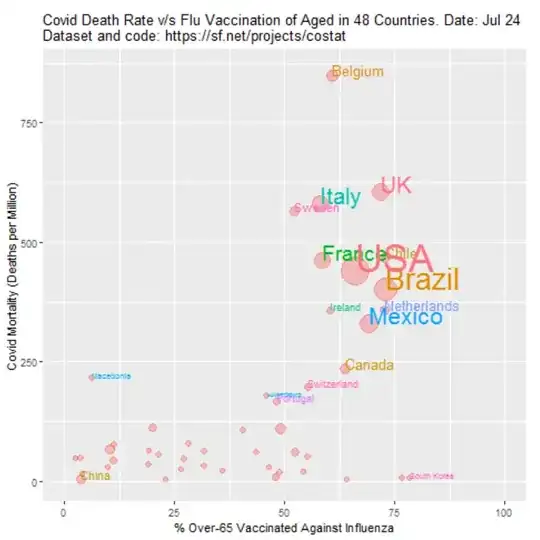
Why not standardizing the data?

You write

That's because I suspect information on differences inherent to these countries *may be lost in such standardization process.

and you write

but I have to account for differences in national age distributions.

I find this contradictory because age standardization is a way to account for differences in national age distributions.

But, you also write

I don't have age information on for Covid deaths in each country.

That is a valid reason why you can not use age standardization. You simply lack the information to do it.

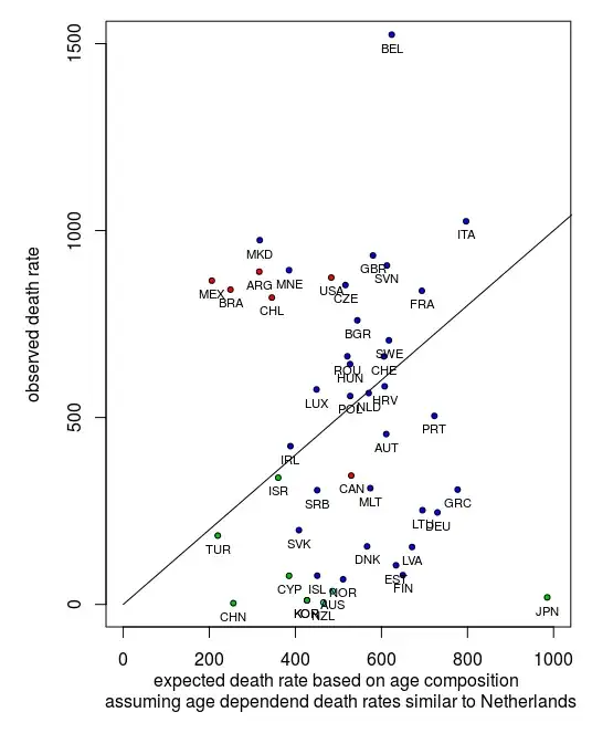
Use a hypothetical age distribution

You could apply a hypothetical age distribution of deaths for the countries where you do not have this information.

You can do this by computing for all countries where you have the age information the relative risk of fatality as a function of age and based on that compute the hypothetical age distribution of the fatalities (hypothetical: if the distribution of fatalities would be according to the estimated/observed risk ratio in each age category)

Below is an example from the code below. The comparison is made with the death rates in the Netherlands. The x-axis gives the expected death rate in a country if it would experience the same age-dependent death rates as observed in the Netherlands. For instance you see Japan (JPN) with an old population having a high expected death rate and China (CHN) with a young population having a low expected death rate. On the y-axis you see the actual observed death rates. For this data and this set of countries, there is no clear correlation or dependency between age and death rate (this means that while age plays a role, it are other factors that are much more important in determining the death rate in a country).

hypothetical

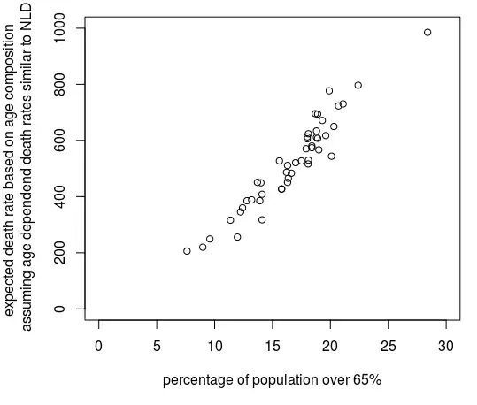
Scale factor dependent on age distribution

Effectively this standardization based on a hypothetical age distribution provides a scale factor by which you multiply the fatality rate. You mention that information might get lost in this way. What you could do instead is perform a regression not on the transformed variable but by using the scale factor as an additional parameter in the model. You can do this either by making the classification into ten groups, but you could also use this scale factor without discretizing and as a non-categorical variable.

Simpler way

The above might be too complex and depending on the public that you are using your analysis for it might be difficult to explain your data and get you into (possibly unneccesary) details. An alternative is that you just use the % of the population that is 65 or older (or use some other age cutoff).

In the image below you see how the complex factor computed with the code below, is not much different from the percentage of the population older than 65.

comparison of complex factor with simple

Example code and graph

example

Eventually, the difference due to the standardization is not so big (the difference with your image is due to the data in this graph being from December instead of August). This is because many other factors play a more important role than age.

In addition, the effect of the parameters that you are investigating, influence vaccination, is not so clear. Even if the effect would be clear then there are too many other factors involved and you can not really say that influenza vaccination has a causal effect (I guess that this might be what you attempt to show).

library(countrycode)
library(readxl)


### data files
data  <- read_excel("Downloads/data.xlsx", sheet = "main")

### XLSX from UN https://population.un.org/wpp/Download/Standard/Population/
data2 <- read_excel("Downloads/WPP2019_POP_F07_1_POPULATION_BY_AGE_BOTH_SEXES.xlsx", skip = 16)

### CSV from RIVM https://www.rivm.nl/coronavirus-covid-19/grafieken
#data3 <- read.csv("~/Downloads/leeftijd-en-geslacht-overledenen.csv", sep=";")
#agecases <- rowSums(data3[,2:3]) ### adding male + female columns
agecases <- c(0,   0,   0,    2,    0,    3,    6,
              13,  11,  42,   76,   133,  241,
              474, 942, 1538, 2063, 2283, 1414, 534)

### John Hopkins data
data4 <- read.csv("https://raw.githubusercontent.com/CSSEGISandData/COVID-19/master/csse_covid_19_data/csse_covid_19_time_series/time_series_covid19_deaths_global.csv")


### selection of countries which have flu vaccination data
sel <- which(!is.na(data$flu))
sel <- sel[-6] ### Remove Liechtenstein for lack of age distribution data
datasel <- data[sel,]


### get a reference key to connect rows with same countries from the two data sets
years <- data2$`Reference date (as of 1 July)`
countries <- countrycode(data2$`Country code`, origin = 'iso3n', destination = 'iso3c' )
refkey <- sapply(datasel$ccode, FUN = function(x) {
                    which((years == 2020) * (countries == x) == 1)[1] 
                })
refkey <- as.numeric(refkey)

### get covid cases from JH data
cc <- 'USA'
name <- countrycode(cc, origin = 'iso3c', destination = 'country.name')

ncases <- function(cc) {
  subsel <- c(1)
  
  ### special cases where JH data has multiple regions
  if (cc == 'NLD') {subsel <- c(5)} ### only use Netherlands, no colonees
  if (cc == 'DNK') {subsel <- c(3)} ### only use Danmark, no Greenland + Faroe  
  if (cc == 'GBR') {subsel <- c(11)} ### only use UK, no colonies 
  if (cc == 'FRA') {subsel <- c(11)} ### only use France, no colonies  
  if (cc == 'AUS') {subsel <- c(1:8)} ### sum all provinces  
  if (cc == 'CAN') {subsel <- c(1:16)} ### sum all provinces  
  if (cc == 'CHN') {subsel <- c(1:33)} ### sum all provinces  

  name <- countrycode(cc, origin = 'iso3c', destination = 'country.name')
  
  ### special cases where JH data uses other country name
  if (cc == 'USA') {name <- 'US'}
  if (cc == 'KOR') {name <- 'Korea, South'}
  
  rows <- which(data4$Country.Region == name)[subsel]
  nc <- max(colSums(data4[rows,-c(1:4)])) ### get the last non-empty column (which is the maximum)
  
  return(nc)
}
ncases <- Vectorize(ncases)

# compute age dependent risk (incidence) based on Netherlands
# this will be roughly an exponential function of age
nrow  = refkey[27]
data_row <- data2[nrow,]
agepop <- as.numeric(data_row[9:28])*1000
agepop[20] <- agepop[20] + as.numeric(data_row[29])*1000  ## combine 95-99 and 100+ to create 95+
agerisk <- agecases/(agepop/10^6)  ### cases per million


###
### function to compute risk based on age distribution
### this will give the risk if the death rates 
### would be according to the data of the Dutch RIVM
###
age_risk <- function (nrow) {
  data_row <- data2[nrow,]
  agepop <- as.numeric(data_row[9:28])*1000
  agepop[20] <- agepop[20] + as.numeric(data_row[29])*1000  ## combine 95-99 and 100+ to create 95+
  avgrisk <- sum(agerisk*agepop)/sum(agepop)
  return(avgrisk)  
}
age_risk <- Vectorize(age_risk)
risk <- age_risk(refkey)  


### plotting

deaths <- ncases(datasel$ccode) ### deaths per country
pop <- datasel$pop


### color + size of bubbles
region <-  countrycode(datasel$ccode, origin = 'iso3c', destination = 'continent' )
color <- as.numeric(as.factor(region))+1
size <- 1+sqrt(datasel$pop)/10^4

### scatterplot
plot(datasel$flu, (deaths/(pop/10^6))/risk, log = "y", 
     pc = 21,
     col = 1, bg = color, cex = size, xlim = c(0,100),
     ylab = "standardized incidence \n (1 = equal to Dutch RIVM figures)",
     xlab = "influenza vacination rates"
     )

lines(c(-10,110),c(1,1), lty = 2, col = 8)

### add labels
text(datasel$flu, (deaths/(pop/10^6))/risk, datasel$ccode, cex = 0.7, pos = 4)
Sextus Empiricus
  • 43,080
  • 1
  • 72
  • 161
  • Thanks Sextus. I've added a snapshot of the unadjusted graph above. Re: 'age standardization' - yes, perhaps I misspoke : I'm new to this. Just starting with your simplest suggestion: how do I use the % of the population (say 65 and older as cutoff)? How would it make the graph above more accurate? Re: hypothetical age distribution of COVID-19 deaths (say, from US CDC data). Won't this cause countries with very high death rates (like the US) to skew data from other countries where distribution isn't known? Finally: any thoughts on clustering (kjetils suggestion)? – Happyblue Dec 10 '20 at 13:59
  • @happyblue I've just downloaded your data and will see if I can incorporate it into the answer. – Sextus Empiricus Dec 10 '20 at 14:02
  • Thanks very much @Sextus - very detailed and extremely generous of your time. I appreciate it very much and couldn't ask for more. I plan to get into your post after work today. A quick question: your standardization incidence graph has incidence on a log scale but on a linear scale it would look similar to my original (linear) graph - that's what you're saying correct? What quantitative metrics can best compares between graphs (e.g. R-square)? I agree: there is no 'causal' smoking gun in correlational study such as this. But the wide discrepancy in death rates does bear investigation. – Happyblue Dec 10 '20 at 22:52
  • @Happyblue I took the data number of deathcases untill December while your data is from August. I did this because the data on which I base the standardization is also untill December, but it also made the picture more different (the log scale plays a role as well but is not the only thing). – Sextus Empiricus Dec 10 '20 at 23:30
  • Regarding quantitative measures, I believe that you can not really compare different countries so well because there are too many differences that are difficult to control for. One example is the high number of deaths for Belgium. The Netherlands also has a higher number of deaths but the reported number for deaths due to covid are underestimated (if you look at excess death then this suggests almost double the amount of deaths). Other factors are population density (currently many cases in more dense areas, this will shift to less dense areas eventually, the growth is just less fast there)... – Sextus Empiricus Dec 10 '20 at 23:34
  • ...better ways to make comparisons would be to look at smaller scale difference. For instance within countries there will be more similarities of the variables (like testing protocols). Also including other data (like mobilisation, number of contacts, multilayers) and testing a more mechanistic modelling might provide more insights. Also using different dependent variables will be better (instead of bulk number of cases, which is an extremely simplified figure for an extremely complex process, one could study more complex data like records from contact tracing). – Sextus Empiricus Dec 10 '20 at 23:40
  • Putting next to each other figures of 'reported cases', 'hospital uptakes', 'reported deaths', 'excess death rate' and comparing them for different countries shows that these figures have highly variable ratios from country to country. Some might argue that death rates are different for different countries, but one might better argue that data collection is highly different and differs from country to country. – Sextus Empiricus Dec 10 '20 at 23:44
  • thank you; I've been slack digging into the rich leads you provided. You're aware of my concern using one country's age-specific mortality curves (the Netherlands' in this case) to 'normalise' other countries is that country-specific information may be lost. Back in May, COVID-19 death rates for the NL '65+' age group were approximately 10 times that of the '55–64' group. But for China, the risk seems 3x rather than 10x, while Switzerland's risk was 20x. (https://bmcpublichealth.biomedcentral.com/articles/10.1186/s12889-020-09826-8/tables/2). I hoping to explore clustering too. – Happyblue Dec 31 '20 at 12:12
  • @Happyblue three effects make that situation less bad than it seems **1** Back in may there might have had higher noise due to numbers of reported deaths not yet being accurate (either due to low numbers and due to early reports that are not final yet). Currently reports are a ten-fold number of deaths. **2** When you are standardizing then the 55-64 group is a small number that doesn't really matter so much. **3** The discrepancy between countries might be greatly influenced due to the different composition of the 65+ group. Death rates roughly double each 10 years. So – Sextus Empiricus Dec 31 '20 at 14:00
  • In that table most countries have a ratio around 1:10. It is only the USA and China that have a relatively high number in the 55-64 age group (but you can't expect magic from this normalisation; this problem is inherent to treating an average death rate instead of a death rate separately for each age group). Some other countries like Canada and Switzerland have low numbers for the 55-64 age group but they also have overall low numbers and it can be noise (and in any case it's not gonna influence the total number a lot because the 55-64 age group is not much relevant). – Sextus Empiricus Dec 31 '20 at 14:05