I have data on one station provided by two sensors that measure solar radiation, let's call A and B where A is the more accurate and the B the less accurate one.
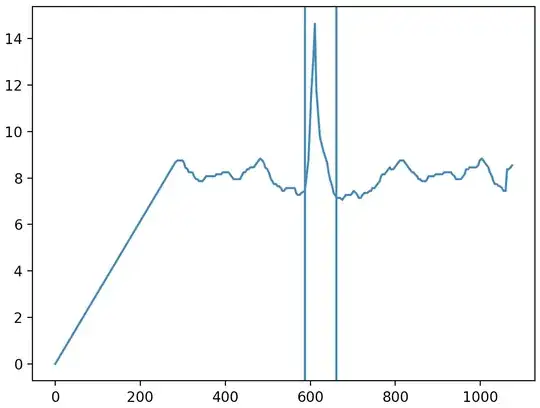
The plot show data from one hour measured by both sensors. The frequency of the measures are one per minute and eventually one or the other has an error on reading, however most of the data are available on both and more than one year of historical data is available.
The question is how should I compare them? The idea is to find how close the B measures are from the sensor A. Firstly, only the data available on both sensors was selected, then the B measures were compared to the A via the following metrics: bias, relative bias, relative root mean square error, and Pearson correlation, all theses metrics are shown in the following table:
$$\begin{array}{|c|c|c|c|c|} \text{Periods} & \text{N} & \text{Bias} & \text{r-Bias} & \text{r-RMSE} & \text{r-pearson} \\ \hline \text{All data} & 454307 & 30.91 & 15.1\% & 215.0\% & 0.6166 \\ \hline \text{2019-09} &7765&15.38&6.1\%&15.0\%&0.9983\\ \hline \text{2019-10} &44628&315.57&136.2\%&605.0\%&0.4468\\ \hline \text{2019-11} &42950&-20.48&9.2\%&19.2\%&0.9978\\ \hline \text{2019-12} &43946&2.90&1.2\%&4.6\%&0.9996\\ \hline \text{2020-01} &27614&2.52&1.3\%&5.4\%&0.9995\\ \hline \text{2020-02} &37737&2.69&1.3\%&5.0\%&0.9995\\ \hline \text{2020-03} &43938&2.51&1.0\%&4.6\%&0.9995\\ \hline \text{2020-04} &43178&2.25&1.1\%&4.1\%&0.9997\\ \hline \text{2020-05} &44639&1.15&0.7\%&3.8\%&0.9997\\ \hline \text{2020-06} &43170&1.19&1.1\%&4.3\%&0.9998\\ \hline \text{2020-07} &37698&1.45&1.0\%&3.8\%&0.9998\\ \hline \text{2020-08} &30099&1.72&0.7\%&2.4\%&0.9998\\ \hline \text{2020-09} &6945&0.35&0.1\%&2.3\%&0.9997\\ \hline \end{array}$$
Should I give a step back and compare them by correlation? I've seen some examples trying to model the time series and compare the models, also t-student test, and so on. Which comparisons should I do?